

Mastering layout in art A practical guide for creative makers
The term layout may seem simple until you try to design a page a poster or a gallery wall that feels cohesive and intentional. In visual arts layout is the backbone of how elements interact with each other and with the viewer. This article explores the meaning of layout its core principles and practical steps you can use to improve your compositions whether you work in painting collage print design or digital media. The aim is to give you a clear method to think about placement scale rhythm and visual flow so your work communicates with confidence.
What layout means in visual practice
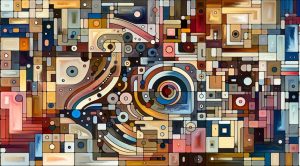
At its core layout is the arrangement of visual elements within a space. It includes where objects sit how they relate to margins how text and image interact and how negative space supports the main subject. Good layout creates hierarchy. It tells the viewer what to look at first and how to move through the work. In art the layout is not just technical it carries mood and can reinforce concept and narrative.
Why layout matters for artists and designers
Strong layout increases clarity and impact. A thoughtful composition can make a simple idea feel profound. It also improves readability when text is involved and ensures that viewers do not miss key elements. For designers layout supports usability and for artists it supports expression. Learning to control layout empowers you to guide attention craft tension and deliver the intended emotion.
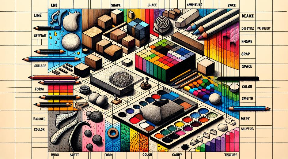
Fundamental principles that shape effective layout
Several timeless principles guide successful layout. Use these as checkpoints when you plan an artwork.
1 Visual hierarchy Decide which element is dominant and which are supporting. Contrast in size value or color can create a clear ranking.
2 Balance Balance can be symmetrical or asymmetrical. Symmetry offers stability. Asymmetry offers dynamism while still feeling balanced if weight and spacing are considered.
3 Rhythm and repetition Repeating shapes lines or colors creates movement and unity. Rhythm helps the eye travel across the composition.
4 Alignment Alignment creates order. Aligning edges or centers of elements gives coherence and a sense of structure.
5 Scale and proportion Changing scale can produce emphasis. Proportion affects how elements relate emotionally and physically within the space.
6 Negative space The empty areas are as important as the filled areas. Negative space can frame the subject and improve legibility.
Applying layout across different mediums
The basic principles apply across many mediums yet each medium has its own constraints and strengths. In painting the canvas edges form a frame that interacts with composition choices. In collage layout is about layering and edge contrast. In print layout you juggle text and image and must account for trimming margins and readability. In digital work you consider screen sizes interactivity and scrolling behavior. Adapting the idea of layout to your medium will lift the quality of your results.
Simple steps to plan a better composition
Follow a structured approach when you begin a new piece. Here is a process that artists and designers can repeat.
Step one Start with a thumbnail sketch Use small quick sketches to test different placements and to explore hierarchy options. Thumbnails are low cost and fast.
Step two Choose a focal point Decide what will pull focus and how other elements support it. Use contrast and isolation to strengthen the focal point.
Step three Establish alignment and grid Even a loose grid can help maintain visual order. Grids are not rules they are guides.
Step four Consider scale and proximity Play with relative size and distance. Group related items close together and separate unrelated items to create clear relationships.
Step five Evaluate negative space Look for awkward gaps or clutter. Editing out elements can improve the overall layout more than adding details.
Step six Iterate Keep versions and compare. Iteration reveals what you missed and can lead to surprising improvements.
Common layout pitfalls and how to avoid them
Many artists fall into similar traps when arranging elements. A steady review process helps avoid these mistakes.
Pitfall one Overcrowding Too many competing elements make the work confusing. Solution Remove or simplify items and add breathing room.
Pitfall two Lack of hierarchy If everything is the same strength nothing will stand out. Solution Use contrast in value size or color to create a clear first second and third reading.
Pitfall three Weak edges Elements that touch the edge of the support without purpose can feel cut off. Solution Intentionally crop or move elements so edge contact feels planned.
Pitfall four Ignoring reading flow For works with text or directional imagery plan how the eye moves. Solution Use lines color and placement to guide movement through the design.
Tools and techniques to refine layout
Traditional techniques include drawing grids using the rule of thirds or the golden proportion to test placements. For digital work most applications offer guides and snapping features that make alignment easier. Collage artists can use masking or tape to reposition pieces before committing. Architects use scaled maquettes and models to test three dimensional layout. Photographers compose with depth of field and perspective to control emphasis.
If you want to deepen your study of composition and layout there are many online resources and courses that cover foundational theory and hands on practice. One platform that offers focused study on learning strategies and creative skills is StudySkillUP.com which includes modules on visual thinking and planning processes that are helpful for artists who want to sharpen their design approach.
Case examples practical before and after
Example one A poster with cluttered text and images can feel chaotic. By reducing the number of type sizes stacking related information and adding generous margins the poster becomes easier to scan and far more persuasive.
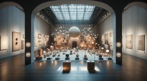
Example two A gallery wall with many small frames looked empty and scattered. By considering a central anchor piece and arranging supporting works around it using consistent spacing the installation read as a single cohesive composition.
Example three A digital portfolio was hard to navigate. Reworking the layout with clear category sections consistent thumbnail sizes and a predictable navigation header improved the user experience and highlighted the work more effectively.
How to practice layout daily
Practice builds intuition. Try these short exercises to train your eye.
Exercise one Daily thumbnails Spend ten minutes a day making small compositions from random shapes. Test different focal points and alignments.
Exercise two Study masters Recreate compositions from artists you admire and analyze their layout choices. Note how they use negative space and balance.
Exercise three Re layout existing work Take a finished piece and make three alternative layouts. Compare what changes the mood and clarity.
Bringing layout into your creative routine
Integrate layout thinking from the earliest stages of a project. Keep sketchbooks for thumbnail planning and save reference setups that worked well. When you document your work include notes on layout choices so you can repeat what works and avoid what does not. For more inspiration and articles on composition visit our main page at museatime.com where you will find guides interviews and visual breakdowns created for artists and makers.
Conclusion
Layout is a foundational skill that amplifies the power of any visual work. By learning the principles of hierarchy balance rhythm and negative space and by practicing a structured planning approach you will see immediate improvements in clarity and impact. Remember that layout is both a technical discipline and a creative choice. Use it to support the story you want to tell and to shape how viewers experience your art.