

Negative Space in Art: Mastering the Power of Emptiness
Negative space is one of the most powerful and underused tools in visual art. At first glance it might seem like empty area or nothingness. In reality negative space is a deliberate choice that shapes perception and guides attention. Whether you are a painter, photographer, graphic designer, or collector, understanding negative space can lift your work from ordinary to striking. This article explores the concept in depth and offers practical techniques to help you compose with intention.
What is negative space?
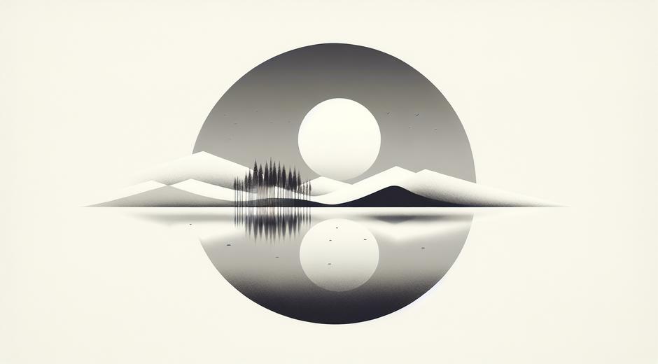
Negative space refers to the empty or open areas around the main subject of an artwork. The positive space is the object or subject that occupies visual attention. The interplay between positive and negative space creates balance, tension, and rhythm in composition. Think of a portrait where the subject is offset against an uncluttered background. The uncluttered background is the negative space that allows the subject to stand out. In graphic design negative space can also form implicit shapes that add meaning without extra elements.
Why negative space matters in composition
Negative space gives the eye room to rest. It prevents visual clutter and makes the composition readable. In advertising and identity work, effective negative space can make a logo memorable. In painting and photography it helps establish depth and focus. The human brain prefers patterns that have clear structure, and negative space contributes to that structure. When used well negative space enhances contrast, clarifies hierarchy, and can even create optical illusions that surprise viewers.
Key principles for using negative space
Balance is central. Too much negative space can make a piece feel empty. Too little can make it feel cramped. Aim to create harmony between the areas that carry information and the areas that support it. Another principle is scale. Large areas of negative space can emphasize isolation or tranquility. Small pockets of negative space can define form and shape at a micro level. Finally consider edge control. How the edges of positive shapes meet negative space changes perception of weight and movement.
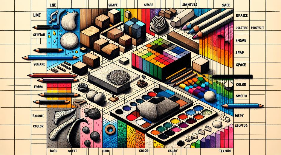
Techniques to create effective negative space
Use contrast to separate subject from background. High contrast between light and dark often clarifies negative space. In color work, contrasting hues can create the same effect. Simplify backgrounds by removing unnecessary details. This concentrates visual interest on the subject and the surrounding space. Train yourself to see shapes as silhouettes. Blocking out an image into simple shapes helps you spot where negative space can be increased or decreased.
Another technique is framing. Leaving intentional margins around a subject can elevate it and create a refined aesthetic. In graphic layouts use padding and spacing to give text and imagery room to breathe. In sculpture consider the voids as part of the form. A hole or cavity can be as expressive as the solid parts.
Using negative space in different media
Painting
In painting negative space is often painted first or reserved as unpainted canvas. Master painters sometimes outline the subject and then shape the negative areas to refine edges. This process helps ensure the positive shapes are harmonious within the whole composition.
Photography
Photographers use negative space to direct focus and tell a story. Portraits with broad empty backgrounds isolate the sitter and evoke mood. Landscape photographers may capture expanses of sky or sea to convey scale and solitude. Minimalist photography relies heavily on negative space to communicate with fewer elements.
Graphic design
Negative space plays a critical role in logos and interfaces. The simplest logos often exploit negative space to hide clever shapes or letters that reward close inspection. In interface design spacing influences usability. Clear negative space makes elements distinct and interactions intuitive.
Sculpture and installation
In three dimensional work negative space is literal and tangible. The way light passes through an object and the shadows it casts are all part of the negative space dialogue. Many modern sculptors deliberately carve voids to invite the viewer to move around the work and experience changing relationships.
Common mistakes to avoid
Overcrowding is the most frequent error. Adding too many details reduces the impact of individual elements. Another mistake is inconsistent spacing. When margins and gutters lack proportion the layout feels amateur. Also avoid relying on negative space as a last minute fix. It is more effective when treated as an integral part of composition from the start rather than an afterthought.
Practical exercises to train your eye
Silhouette exercise
Take photographs or sketches and convert them into simple black and white silhouettes. Focus on the shapes formed by the background around the subject. This will help you recognize and manipulate negative space.
Cropping study
Crop images aggressively to see how composition changes. Some crops will highlight negative space and others will reveal awkward voids. Practice until you can intuitively choose a crop that feels balanced.
Limited element challenge
Create a composition using only three elements plus background. Limitations force you to consider spacing and relationships carefully. This exercise is useful for designers and painters alike.
Negative space in branding and visual identity
Brands that use negative space effectively benefit from instant recognition and clever visual messaging. A subtle shape hidden within negative space can convey multiple meanings without cluttering the design. For emerging artists and designers, studying iconic logos helps reveal how economy of form enhances recall. If you are seeking curated content about visual trends and the role of composition in media, visit GamingNewsHead.com for examples of how game interfaces apply negative space to improve player experience.
How to test your compositions
Distance test
Step back from your work. Distance helps you see the balance between positive and negative areas. A composition that reads well from afar usually has a strong negative space strategy.
Mirror test
View your work in a mirror. Reflection can reveal asymmetries and unbalanced spaces that were not obvious.
Scale test
Reduce your work to a thumbnail size. Thumbnails expose whether the negative space and the main subject remain readable when scaled down. This is especially important for logos and social media imagery.
Teaching others to see negative space
When you teach students to appreciate negative space, encourage them to draw the spaces between objects rather than the objects themselves. This inversion trains perception and builds confidence. Assign exercises that require restraint. Ask students to remove elements until the composition still reads clearly. Over time they will learn that sometimes less presence produces a stronger presence.
Conclusion
Negative space is a quiet but decisive element of visual language. It clarifies, it surprises, and it enhances the emotional tone of a work. Whether you are composing a painting, taking a photograph, laying out a page, or crafting a brand identity, deliberate attention to negative space will improve your results. For further reading and inspiration across a wide range of visual culture topics visit museatime.com to explore essays and tutorials that help you refine your practice.
Mastering negative space is not about removing content for its own sake. It is about creating relationships between what is present and what is not. That balance is where strong visual communication lives.