

Visual Weight in Art How to Use Perceived Mass to Strengthen Your Composition
Visual Weight is one of the most powerful yet often overlooked tools an artist can use to guide the viewer eye and create emotional impact. Whether you work in painting photography collage or digital design understanding how elements carry weight on the picture plane will help you control balance focus and mood. This article explains what Visual Weight means how it functions and practical ways to shape it in your work so your compositions read with clarity and intention.
What Visual Weight Really Means
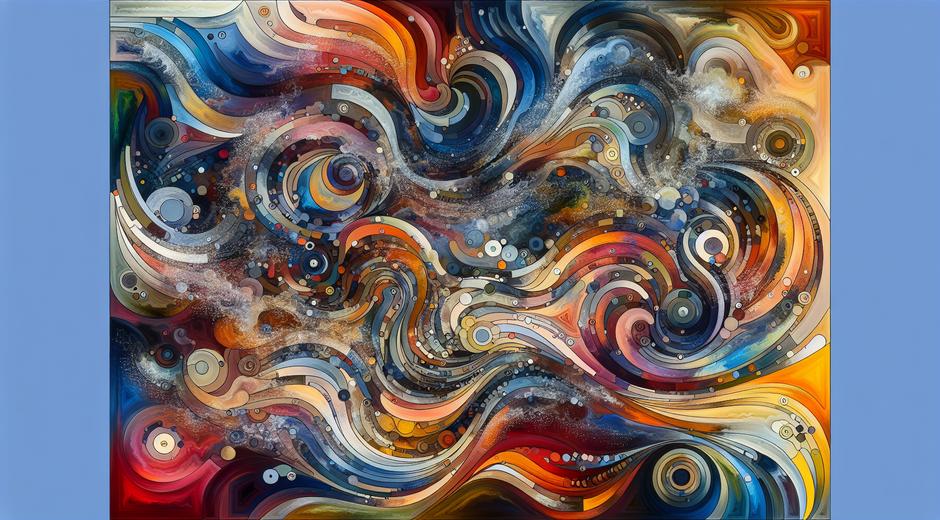
Visual Weight refers to the perceived heaviness or lightness of a visual element within a composition. It is not physical mass but a visual effect created by factors such as size color contrast detail and placement. A small bright object can feel heavier than a large muted object because of contrast. A richly textured area may pull more attention than a smooth expanse even when both occupy the same space. Learning to predict and manipulate Visual Weight is essential for crafting strong images that communicate clearly.
Key Factors That Determine Visual Weight
- Size Larger forms usually read as heavier than smaller ones.
- Value Contrast High contrast between an element and its background increases perceived weight.
- Color Warm and saturated hues tend to feel heavier than cool muted tones.
- Detail and Texture Complex areas attract the eye more than simple ones.
- Edge Clarity Sharp edges hold attention longer than soft edges.
- Position Elements placed near the top or right of a frame may feel heavier in cultures that read left to right.
- Isolation A single object surrounded by empty space often seems important and heavy.
Understanding these factors allows you to compose intentionally. For example you can counterbalance a dark dense cluster with a small bright shape so the overall composition feels stable. Or you can use deliberate imbalance to create tension and motion.
How Visual Weight Creates Balance and Focus
Visual Weight is the mechanism behind balance and focal emphasis. When weight is distributed evenly the image reads as calm and resolved. When weight is concentrated on one side the composition can feel dynamic or unstable depending on your intent. Artists use both symmetry and asymmetry to achieve desirable effects.
Symmetrical balance often implies formality stability and order. Asymmetrical balance feels more natural and interesting. In asymmetrical layouts you match weights rather than sizes. A cluster of small dark elements can balance one larger light element by matching perceived weight. This matching allows flexible and lively compositions that still read as intentional.
Practical Techniques to Control Visual Weight
Here are practical strategies you can apply today to manipulate Visual Weight with confidence.
- Adjust scale Increase or decrease object size to raise or lower its weight.
- Manipulate value Use high contrast to make an object dominate or low contrast to recess it.
- Change color Introduce a saturated warm hue to create a focal heavyweight or use cool muted tones to reduce impact.
- Refine texture Add detail to bring elements forward and simplify to push them back.
- Control edges Use crisp edges to emphasize important forms and soft edges to blend supporting areas.
- Play with isolation Allow a single subject space around it to amplify its presence without changing scale.
- Use repetition Multiple small elements can combine to equal the weight of a single larger form.
Apply these techniques in layers. For example combine scale and color to make a small object punch through a complex background or use subtle value shifts and texture changes to create depth while maintaining harmony.
Exercises to Train Your Eye
Practice is the fastest route to mastery. Try these exercises to develop intuition for Visual Weight.
- Collage balancing Cut shapes from magazines and arrange them on a sheet until the composition feels stable. Photograph each attempt and compare which arrangements read as balanced and why.
- Value only study Paint or draw a subject using only neutral tones. Focus on achieving the right weight relationships without color. This sharpens sensitivity to value contrast.
- Color swap Take a painting or photograph and swap the color of a single element. Note how the focal point shifts when hue or saturation changes.
- Crop variations Crop the same image in different ways and observe how placement and edge proximity change perceived weight.
Applying Visual Weight Across Different Mediums
Visual Weight is universal. Its principles apply to traditional media installation and screen based work though the techniques may differ.
In painting and drawing weight often comes from value and texture. In photography weight is influenced by exposure contrast and subject isolation. In graphic design weight can be manipulated with typography color and negative space. In sculpture weight has a literal component but perceived weight is shaped by mass distribution surface finish and the relationship to surrounding space.
No matter the medium practice shifting weight with minimal changes. Often a subtle tweak to color or a single adjustment to placement will be enough to transform the reading of the whole piece.
Common Mistakes and How to Fix Them
Here are pitfalls artists encounter and simple fixes based on Visual Weight principles.
- Too many heavy elements The image feels chaotic. Fix by reducing contrast or simplifying texture in secondary areas or by creating more negative space.
- Unexpected focal point Viewers look at the wrong place. Fix by muting the distracting element or increasing the weight of the intended focal area.
- Flat composition The image lacks depth. Fix by enhancing value contrast between foreground and background and by sharpening edges of foreground forms.
- Overcompensation Heavy corrections can create new imbalances. Fix by incrementing changes and stepping back often to reassess overall balance.
Case Studies and Visual Analysis
Study master works to see Visual Weight in action. Observe how a single bright brush stroke can anchor a painting or how an asymmetrical layout in a photograph can create narrative tension. When you analyze works look for the factors that assign weight and consider how you could alter them to produce different emotional responses.
For curated lessons and articles on composition and related topics visit museatime.com for practical guides and visual studies that will deepen your understanding. If you are looking for curated prints or art related products that help you present your work professionally check out Romantichs.com for selections that pair well with strong compositional study.
Conclusion
Visual Weight is a subtle yet decisive tool. By learning to read weight and by practicing targeted adjustments you will gain control over where viewers look how they feel and the clarity of your message. Start with small experiments change one variable at a time and keep a sketchbook of trials and results. Over time your choices will become instinctive and your compositions will communicate with greater power and intention.
Use these insights to refine your next piece and remember that balance is often a dialogue between control and discovery. Study craft observe outcomes and allow Visual Weight to become part of your expressive toolkit.