

Color Harmony A Practical Guide for Artists
Color Harmony is the foundation of visual cohesion in painting design photography and digital art. When colors relate to one another in a balanced way the result is pleasing to the eye and communicates mood and meaning with clarity. This article explores the theory and practice of Color Harmony and offers actionable tips artists can apply right away to strengthen composition enhance mood and guide viewer attention.
What Color Harmony Means
Color Harmony refers to the way two or more colors work together in a composition. Harmony can be achieved through contrast through similarity or through careful control of values and saturation. In art a harmonious palette supports the main idea of a piece rather than competing with it. Harmony does not mean all colors must match exactly. Instead it means each color contributes to a unified visual experience.
The Color Wheel and Basic Relationships
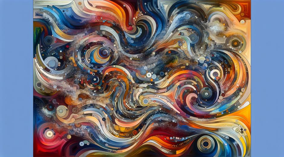
The color wheel is the most useful tool for understanding Color Harmony. Primaries secondaries and tertiaries sit around the wheel and their spatial relationships suggest different harmony strategies. Some of the classic relationships used by artists include complementary analogous triadic tetradic and monochromatic schemes. Each offers a distinct balance between contrast and cohesion.
Complementary pairs place colors opposite each other on the wheel. That pairing creates strong contrast that can energize a composition. Analogous colors sit next to each other and create a gentle flow that is soothing and unified. Triadic harmony uses three colors evenly spaced around the wheel for a lively balanced effect. Tetradic harmony uses two complementary pairs for rich variety while monochromatic harmony relies on a single hue varied in value and saturation for subtle depth.
Temperature Value and Saturation Matters
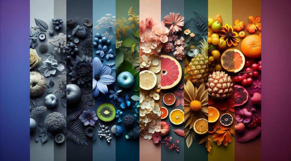
Color Harmony depends on more than hue alone. Temperature value and saturation shape how colors interact. Warm colors such as reds oranges and yellows advance toward the viewer while cool colors like blues greens and violets recede. Value refers to lightness or darkness and is essential for legibility and focal control. Saturation controls intensity. A bright saturated accent paired with muted neighbors can become a focal point without disrupting harmony.
Artists often balance temperature by juxtaposing warm and cool tones while using value contrasts to suggest form and light. For example a portrait may use warm mid tones in the skin balanced by cool muted backgrounds so the figure reads clearly while still feeling integrated with the setting.
Compositional Role of Color Harmony
Color Harmony supports composition by guiding where the eye travels and by clarifying hierarchy. Use color to separate foreground from background to highlight the main subject and to create rhythm across the canvas. Repeating a color in several places creates visual links and reinforces structure. Changing saturation and value of a repeated color can maintain harmony while avoiding monotony.
Consider using a dominant color a secondary color and an accent color. The dominant color sets the overall mood the secondary color adds support and texture and the accent color draws attention to points of interest. This simple ratio helps maintain harmony because it creates clear roles for each color.
Psychology and Cultural Context
Color Harmony also has a psychological layer. Colors evoke emotions and cultural meanings. A harmonious palette that uses blues and greens may suggest calm and trust while a harmonious palette built from warm oranges and reds may feel energetic and intimate. When making color choices consider the cultural context of your audience and the emotional tone you intend to set.
Experiment with subtle shifts in hue and saturation to refine mood without sacrificing harmony. Often small adjustments to the balance between warm and cool tones can change perceived atmosphere dramatically while keeping the overall palette coherent.
Practical Exercises to Build Skill
Practice is the fastest path to mastering Color Harmony. Try these exercises in your sketchbook or digital workspace.
1 Choose a reference image and reduce it to three values and three hues then repaint the scene focusing on relationships rather than detail.
2 Create a series of thumbnails where you only change the dominant hue. Observe how mood and readability shift.
3 Limit a palette to one hue and explore value and saturation. This builds sensitivity to light and form.
4 Swap one color in a finished study with its complementary color and note how the contrast alters the balance.
These focused experiments train your eye to see harmony patterns and to make deliberate choices.
Tools and Digital Workflows
Digital tools make exploring Color Harmony faster. Use a color wheel tool to test relationships and use layers to isolate hue value and saturation adjustments. Many art programs offer harmony guides such as analogous complementary and triadic presets that allow rapid prototyping. Save your favorite palettes and label them with mood tags so you can recall them for future projects.
For artists who publish work or who want community feedback it helps to present a small palette swatch alongside an image. This makes the harmony decisions transparent and helps collectors or clients understand the visual logic.
Examples from Art History to Contemporary Practice
Studying masters and contemporary peers reveals practical applications of Color Harmony. Impressionist painters often used complementary contrasts to increase vibrancy while maintaining a harmonious surface. Modern designers may use restrained monochrome palettes with a single bright accent to create iconic brand visuals. In both cases harmony is the engine that makes the choices feel intentional rather than random.
When analyzing other artists look for dominant secondary and accent colors and ask how value and saturation are distributed. This will reveal patterns that you can adapt to your own work.
Testing Palettes and Iteration
A palette that looks good on a small screen may read differently in print or under gallery lighting. Test colors under multiple lighting conditions and on different materials. Print proofs and mockups help you see how pigments translate across media. Iteration is key. Slight changes in value or saturation can solve balance issues without changing the main idea.
Keep a palette log for each project listing hex values or paint mixtures. This record makes it simple to recreate or refine palettes in future work.
Color Harmony for Online Presence and Promotion
If you share your work online a harmonious visual identity helps with recognition and discoverability. Consistent palettes across your portfolio social pages and promotional materials create a cohesive brand presence. For process posts include swatches and brief notes about your harmony strategy to engage other artists and collectors.
For more in depth tutorials and curated collections of color studies visit museatime.com where you will find articles interviews and step by step guides on palette building and color theory.
Resources and Further Reading
There are many resources that expand on harmony theory and practical use cases in design and branding. If you are exploring how color harmony functions in business identity and consumer perception a good resource is BusinessForumHub.com which covers case studies and expert commentary on visual strategy.
Final Thoughts and Action Steps
Color Harmony is both a theory and a set of habits. Learning the relationships on the color wheel and practicing control of temperature value and saturation will strengthen your work. Use small palettes experiment deliberately and test across media. Keep records of successful palettes and use them as a starting point for new projects. Over time your eye will internalize harmony patterns and you will be able to make bolder creative choices with confidence.
Start today by selecting a simple reference and creating three thumbnail studies each with a different harmony approach. Compare the results and choose the one that best supports your idea. With consistent practice Color Harmony will become an intuitive part of your visual vocabulary.