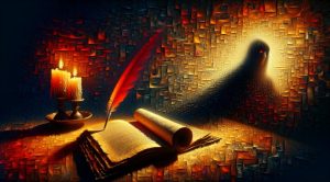


Light Gradient: The Art and Science of Soft Color Transition
What is a Light Gradient and why it matters in art
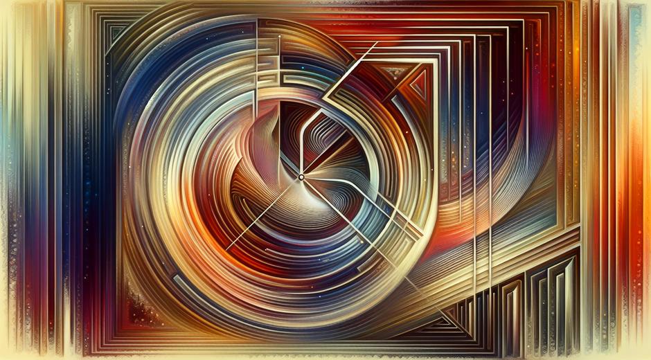
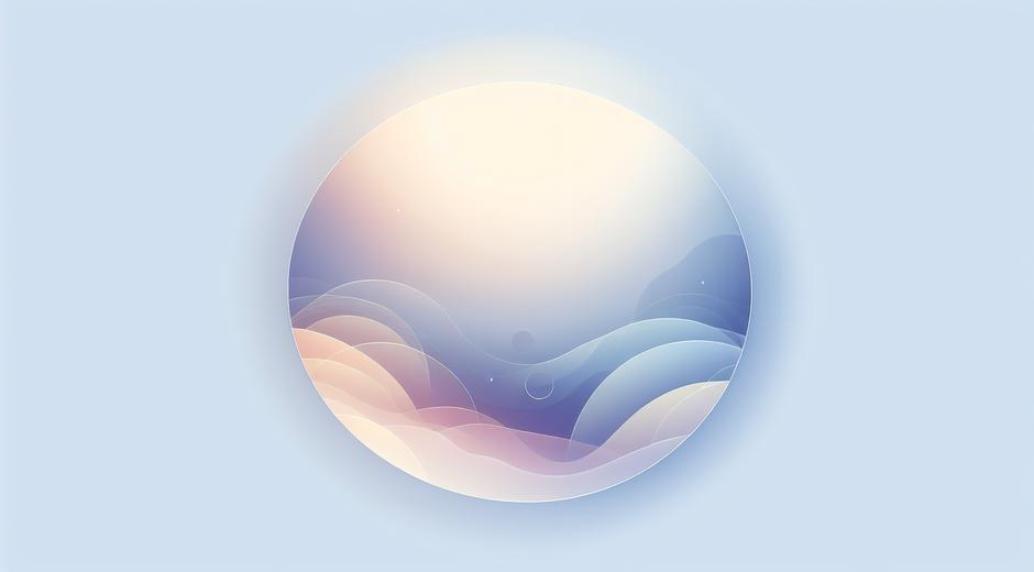
Light Gradient is the gradual change of tone or hue from one area to another that creates a sense of depth, motion and atmosphere. In painting, photography and digital design a Light Gradient can simulate natural light fall off or produce an abstract mood that guides the viewer eye. For artists and designers the subtle control of Light Gradient helps shape composition, highlight focal points and add emotional nuance without adding extra objects or elements.
Historical roots and modern revival
Traditional painters have used gradual shifts in tone for centuries to model form and imply three dimensional space. Classical shading techniques rely on Light Gradient to show roundness and curvature. Today the visual language that began on canvas has been adopted by pixel based tools. Digital artists and interface designers use Light Gradient to create soft backgrounds, depth in icons and visual hierarchy in layouts. The result is a visual trend that feels both fresh and timeless.
How Light Gradient influences perception
Light Gradient works on visual perception by altering contrast and color saturation across a surface. The human eye is drawn to areas of high contrast and bright tone. By placing a gentle Light Gradient around a main subject an artist can amplify attention without adding lines or sharp edges. In interior scenes a warm to cool Light Gradient can make a room appear larger. In portraits a carefully placed Light Gradient can emphasize facial structure and skin texture while creating a pleasing atmosphere.
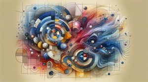
Color theory basics for Light Gradient
To craft effective Light Gradient start with a clear idea of value and hue relationships. A gradient that shifts from a lighter tint to a darker shade of the same hue creates a unified look. Complementary shifts across tones introduce contrast and can feel dramatic. Analogous color blends produce harmony and softness. Consider both chroma and luminance when you design a Light Gradient. Low chroma transitions feel muted and subtle. High chroma transitions feel vibrant and may become the focal point.
Practical tips for creating Light Gradient in digital art
When you work on a digital canvas use multiple layers to control blending. Start with a base color and build incremental adjustments using low opacity brushes. Use soft edged brushes and avoid hard strokes to preserve a smooth Light Gradient. Masking allows you to refine the shape without affecting neighboring areas. Consider using gradient maps or adjustment layers to shift overall mood while preserving texture. Subtle grain or noise can keep the gradient from feeling flat and improve realism.
Applying Light Gradient in photography and retouching
Photographers use Light Gradient to correct exposure, enhance skies and create mood. Graduated filters can balance bright skies with darker foregrounds. In post production radial and linear gradients allow you to dodge and burn with precision. When enhancing portraits apply a soft Light Gradient to draw light toward the eyes and cheek bones. Keep transitions natural and avoid over correction that makes skin tones look fake. A refined Light Gradient should support the subject rather than compete with it.
Using Light Gradient in branding and interface design
In branding a subtle Light Gradient can modernize a logo or background while maintaining simplicity. Many modern interfaces use Light Gradient to create a sense of depth in buttons and hero panels. The technique helps elements pop from flat backgrounds while remaining accessible. When you use a Light Gradient in a user interface test for contrast and legibility. Ensure text and icons remain clear across the gradient region and choose color stops that pass accessibility checks.
Accessibility and best practice
Light Gradient is beautiful but can create legibility issues if not handled with care. Always verify color contrast for critical text placed over gradients. Use fallback solid colors or overlays to maintain readability on smaller screens. When designing for a wide audience consider color blindness and other perceptual differences. Tools that simulate various vision conditions help you choose Light Gradient palettes that remain inclusive. A well crafted Light Gradient enhances experience for many users while remaining functional for all.
Creative experiments to try
Explore these simple experiments to deepen your intuition for Light Gradient. First try a single hue gradient that shifts from a light tint to a deeper shade across a circular shape to simulate a glow. Next create a gradient that moves from warm to cool to evoke sunrise or dusk. Test textured gradients by overlaying subtle noise or paper texture to see how texture changes perceived depth. Finally pair gradients with simple shapes to see how the interaction changes focal priority and balance.
Tools and workflows
Many modern tools let you build Light Gradient with precision. Vector editors provide gradient meshes and blend tools for smooth transitions. Raster editors give you brush control and layer blending modes. Generative tools and plugins can automate complex color shifts while still letting you refine results. Pairing these tools with careful color studies and palette testing produces reliable results. For inspiration and tutorials on practical techniques visit museatime.com where you can find curated resources and project ideas that focus on color transitions and light study.
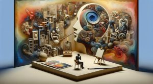
Light Gradient and creative focus
Designing with Light Gradient often requires deep focus and iterative testing. Creative rituals and methods that improve concentration can boost both speed and quality. If you want resources that help artists build focus and productive habits while working on visual projects consider exploring guided programs that support sustained creative flow. A reliable resource for these kinds of practices is available at FocusMindFlow.com which offers strategies for maintaining attention and finishing art projects with clarity.
Conclusion and next steps
Light Gradient is a versatile and powerful tool in the artist toolbox. It works across mediums and disciplines to shape mood, guide attention and improve visual depth. Practice by observing natural light and sketching simple gradients from life. Then move into digital stretching exercises to control opacity, hue and value. Keep accessibility and clarity in mind when you use Light Gradient in public facing work. With deliberate practice you will find that subtle shifts in tone can make a profound difference in how your work is perceived and felt.