

Color Dominance in Art: How One Hue Shapes Perception
What Color Dominance Means for Artists and Viewers
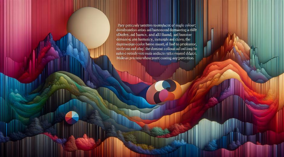
Color Dominance is the idea that a single hue can control the mood form and focus of an image or object. In painting photography and design one dominant color can guide the eye create emotional weight and define a work even when other hues are present. Understanding how and why a color becomes dominant helps artists create stronger compositions and helps viewers read images more quickly and with greater nuance.
Color Dominance is not just about using large areas of one hue. It can be achieved by contrast by tonal intensity or by strategic placement. A bright warm hue placed against muted cool tones will almost always become the focal authority. Likewise a deep saturated blue can draw attention even if it occupies a small area when the surrounding colors are pale or low contrast. The principle links color theory and visual hierarchy so that choices about pigment or pixel are as important as choices about line and form.
The Psychology Behind Color Dominance
Human brains respond quickly to color. Certain hues trigger innate associations. Warm colors such as red evoke energy and urgency while cool colors such as blue evoke calm and depth. When a dominant color aligns with the intended emotion of a piece the message becomes immediate. A single dominant hue can reduce ambiguity and make the narrative stronger.
Perception studies show that color can alter how we judge space and time. A room that is painted with a dominant pale color can feel larger and more open. In a painting a dominant dark hue can compress space and feel intimate. Artists who study Color Dominance learn to manipulate these perceptual cues to guide the viewer through the work.
Color Dominance and Composition Techniques
There are practical techniques artists use to establish Color Dominance. One method is scale use where a dominant color covers a larger area than other hues. Another method is contrast where a color stands out because surrounding colors are less saturated or less bright. Placement matters too. A dominant color placed at the intersection of major compositional lines will amplify its influence.
Balance is key. A dominant color does not mean disorder. Instead it can anchor the composition. Consider a work where a vivid scarlet appears in a small area near the focal point while the rest of the canvas is neutral. The scarlet becomes a visual magnet creating a center of interest. On the contrary if too many saturated hues compete the image becomes chaotic. Clear intention is the core of effective Color Dominance.
Historical Examples of Color Dominance
Art history offers many lessons in Color Dominance. Impressionist painters used complementary color contrasts to make one hue feel dominant without overwhelming the scene. Expressionists used single bold hues to convey mood and identity. In modern art artists often stripped away detail to let color alone serve as subject matter. These movements show that Color Dominance can be subtle or overt and can carry symbolic meaning as well as aesthetic weight.
In popular modern painting a large field of a single hue can suggest spirituality meditation or even political stance. The dominance of a color can become a signature for an artist creating a visual language that is instantly recognizable.
Color Dominance in Contemporary Media and Design
Designers apply Color Dominance to branding interfaces and environmental design. A dominant brand color can create recognition and emotional recall across print screen and space. In interface design using a dominant accent color for buttons and calls to action helps users know where to click and improves conversion. In exhibition design a dominant wall color can shape how viewers move through a gallery and how they perceive works on display.
Travel and landscape photographers use Color Dominance to evoke place and atmosphere. A vast field of golden light at sunset or a stretch of turquoise ocean can become the heart of an image that viewers remember. Travel editors sometimes commission photo essays that explore a single hue across many locations to show continuity and mood. For more travel insights and visual storytelling examples visit TripBeyondTravel.com which often highlights how color defines place in compelling ways.
Practical Exercises to Master Color Dominance
Practice builds intuition. Try these studio and camera exercises to strengthen your ability to create Color Dominance.
1 Observe and isolate: In a busy scene pick one color and photograph only that color area. Notice how the image reads with limited palette.
2 Reduce intensity: Paint a scene in muted tones then add a single saturated stroke. Study how that stroke changes focus.
3 Swap roles: Take a successful composition and change the dominant color. Observe how mood and meaning shift.
4 Limit palette: Work with two or three hues only. Learn how dominance can be achieved by value and placement rather than by adding more colors.
These practices help artists and designers make intentional choices. Over time you will learn which colors command attention in your own work and which combinations support subtlety.
Color Dominance for Galleries and Collectors
Curators use Color Dominance when arranging shows. A sequence that starts with cool passive pieces and advances to warm active ones creates a natural narrative arc. For collectors color dominance can affect display decisions. A work with a strong dominant hue might need neutral surroundings or it might become the statement piece of a room. Lighting also interacts with dominance. A change in color temperature of light can alter which hue feels dominant and thus which aspect of a work becomes prominent.
When acquiring new work consider how its Color Dominance will interact with existing pieces and with the space where it will hang. A dominant teal may calm a lively room while a dominant yellow may energize a subdued environment.
Digital Tools and Color Dominance
Digital tools let creators test dominance with speed. Color pickers and overlay modes allow experimentation with saturation and opacity. Designers can simulate print or light effects to see how dominance shifts across media. Image editing software can isolate a hue and let artists gauge its visual weight by comparing histograms and color balance.
For artists who maintain a blog or an online portfolio it is vital to consider how Color Dominance reads on different screens. What looks dominant on a calibrated monitor may appear less so on a mobile device. Test across a range of displays and consider user context so your intended dominant hue remains consistent for the widest audience.
Conclusion: Make Color Dominance Work for You
Color Dominance is a powerful creative tool. It shapes perception controls focus and conveys emotion with immediacy. Whether you are a painter photographer designer or curator the intentional use of a dominant color can transform your work from mere decoration to meaningful communication. Study examples from art history practice deliberate exercises and test across environments to refine your skill.
For artists who want regular tips case studies and exhibition reviews visit museatime.com where discussions about color and composition appear alongside features on emerging artists and classic works. By paying attention to how color claims space and eye you will find new ways to tell stories and to make images that linger with viewers long after they have looked away.