

Contrast Range in Art Understanding Light and Form
The phrase Contrast Range is central to any discussion about visual art. From painting to photography to digital design the range between dark and light informs mood form and spatial depth. This article explores what Contrast Range means how artists measure it and how you can use it to strengthen composition and narrative in your work. It also includes practical steps for expanding or limiting the Contrast Range to achieve a desired effect.
What Contrast Range Means in Visual Practice
Contrast Range refers to the span between the darkest tones and the brightest tones in an image or scene. In a painting a full Contrast Range will show pure deep darks and bright highlights with a spectrum of midtones in between. In photography the same concept relates to how much detail is preserved in shadows and highlights given lighting and camera settings. In print and on screen the available Contrast Range is limited by materials technology and settings.
Understanding Contrast Range helps the artist decide where to place emphasis. Areas with strong contrast draw attention while areas with gentle contrast support flow. The human eye and brain naturally read contrast as a cue for depth and importance. Mastering Contrast Range means gaining control over what a viewer notices first and how their gaze moves through the work.
Contrast Range and Artistic Intention
When you choose a wide Contrast Range you create a scene with strong drama and vivid presence. This is often used in portrait work where deep shadow can sculpt the face and bright highlights can emphasize texture. A narrow Contrast Range on the other hand can create a soft calm feeling. It can unify elements and emphasize form without dramatic distraction.
Consider the mood you wish to convey. If the narrative requires tension mystery or energy increase the Contrast Range. If you aim for harmony subtlety or nostalgia reduce the Contrast Range and let softer transitions guide the viewer. The directive is not absolute. Many iconic works use both strategies within a single composition by isolating a spot of high contrast within a broad field of gentle tones.
Measuring and Controlling Contrast Range
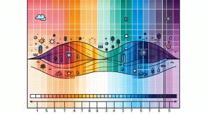
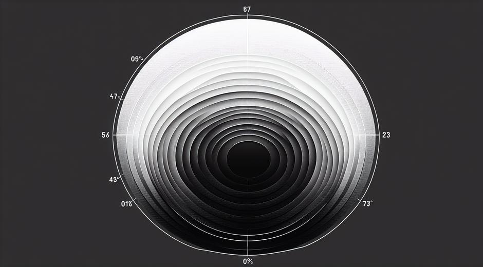
Artists and technicians use multiple tools to measure Contrast Range. In photography histograms offer a visual summary of tonal distribution. A histogram that covers the full span from left to right suggests a wide Contrast Range while a histogram concentrated near the center points to a narrow range. In painting the practice is more intuitive yet measurable by comparing the value steps between darkest and brightest notes.
To control Contrast Range use three practical methods. First adjust the light source. Softer light reduces shadow depth and narrows the Contrast Range. Harder light deepens shadow and raises maximum highlight intensity. Second adjust materials. Reflective surfaces and glossy finishes increase perceived contrast while matte surfaces absorb light and soften transitions. Third manage color and value. Darker pigments and saturated colors increase contrast relative to nearby tones while desaturated tones soften it.
Contrast Range in Color Theory and Composition
Contrast Range is not only about light and dark. It also includes contrasts between color temperatures and saturation levels. Warm tones tend to appear closer to the viewer while cool tones recede. Using warm highlights against cool midtones can increase perceived contrast even if the value range is modest. Similarly placing a saturated color against a desaturated background creates a contrast that functions like a light dark difference in guiding attention.
Compositionally Contrast Range helps define focal points. A small area with distinct contrast will act as a visual anchor and can help balance complex arrangements. When planning a piece think about where you want the most contrast and how other areas will support or counterbalance it. Too much contrast spread evenly across a piece can create visual noise while too little contrast can make a scene feel flat and indistinct.
Practical Exercises for Expanding Skill
Practice is the surest way to master Contrast Range. Try these exercises to build confidence. First create a study that uses only five value steps from darkest to brightest. Limit your palette and focus on smooth transitions. Then create a second study where you expand to ten value steps. Compare how space depth and drama shift with increased range. Second photograph a still life under both soft and hard light. Notice how shadows reveal texture and how highlights can become the main feature. Third experiment with color temperature contrast by placing warm and cool notes in adjacent areas and observing the interaction.
As you repeat these exercises you will develop a sense for subtle value shifts that can transform an ordinary scene into a compelling image. Keep a sketchbook of tonal thumbnails so that you can plan Contrast Range before committing to a full scale piece.
Technical Limits and Display Considerations
No matter how skillful the artist some display media impose limits. Print media have a narrower Contrast Range than most digital displays. Even within digital platforms the Contrast Range that a viewer experiences depends on screen type and settings. This means artists must anticipate how work will look across multiple contexts. If you intend to print a piece keep a copy that is adjusted for print range and test proofs before a final run.
For digital presentation learn to use tools that simulate display constraints. Soft proofing in image editing software gives a preview of how tones will compress. Galleries and museums also present constraints through lighting choices. Curators often use specific fixtures to manage the Contrast Range visitors encounter so that artworks read as intended under gallery light.
Common Mistakes and How to Avoid Them
A common mistake is assuming that more contrast is always better. Excessive Contrast Range can obscure delicate details and create fatigue when viewing. The opposite mistake is avoiding contrast to the point where nothing reads clearly. To avoid both errors test work at multiple scales. View thumbnails full size and also from a distance. If a key element loses clarity adjust the Contrast Range around it.
Another mistake occurs when contrast decisions are made only at the end of the process. Plan contrast from the first sketches through layering choices. This allows you to build depth gradually rather than forcing extreme adjustments later that can harm harmony and texture.
Case Studies from Photography Painting and Digital Art
In photography masters of portrait work often use a controlled Contrast Range to create mood. They dial the range to maintain detail in highlights such as eyes while allowing background elements to fall softly into shadow. In classical painting artists used contrast to model form and to create illusionistic depth. A small bright touch on a fold of fabric or on a bead of moisture can suggest a world of texture around it.
Digital artists have the advantage of layers and masks to test Contrast Range non destructively. They can push highlights and shadows independently and preserve original detail. Still the core aesthetic decisions remain the same. Which areas should arrest the viewer which should support and which should recede. Answering these questions is the essence of working with Contrast Range across all media.
Resources and Next Steps
If you seek more essays tutorials and visual guides on Contrast Range and other key topics in art consider visiting trusted art hubs online. For curated content that spans practice theory and exhibition news explore museatime.com for fresh perspectives and project ideas. If you are planning a home studio or a gallery space remember that environment affects Contrast Range in real time. For resources in property and studio design check guidance from industry specialists such as MetroPropertyHomes.com where layout and light are central to how art reads in a space.
Conclusion
Contrast Range is a fundamental lever for any visual artist. It shapes mood defines focal points and creates the illusion of volume and depth. By learning to measure and manipulate Contrast Range through lighting materials color and composition you gain powerful control over viewer experience. Practice with intention study how works you admire manage contrast and test your pieces under real world display conditions. The more you engage with Contrast Range the more precise and expressive your visual language will become.