

Visual Emphasis: A Practical Guide for Artists and Designers
Visual Emphasis is a core concept in art and design that helps creators direct attention, communicate ideas and shape emotional responses. Whether you work with painting, photography, illustration or digital media, understanding how to create a clear and compelling focal point can transform a composition from ordinary to memorable. This article explores the theory behind Visual Emphasis and offers practical techniques you can apply to your next project.
Why Visual Emphasis Matters
At its simplest, Visual Emphasis controls what the viewer looks at first and what they notice next. Good emphasis clarifies narrative and purpose. It can highlight a subject, support a message or create tension. Without deliberate emphasis, a work can feel flat because the eye does not know where to rest. Artists and designers use emphasis to guide interpretation, to define hierarchy and to enrich the experience of looking.
Fundamental Principles Behind Visual Emphasis
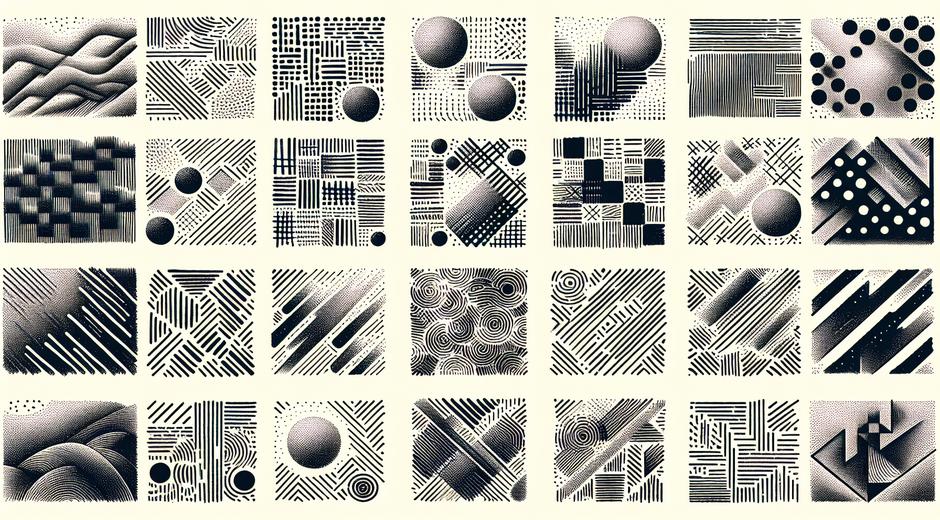
Several principles drive how emphasis is achieved. Contrast, color, size, placement and isolation are among the most reliable tools. Contrast creates difference between elements so one stands out. Color can attract attention by virtue of hue, saturation and value. Size matters because larger elements often read as more important. Placement influences emphasis when an object sits on a strong axis or at a point of interest. Isolation gives importance when a single element is set apart from a group.
Contrast and Color
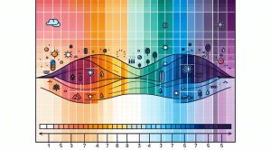
Contrast in tone and color is one of the fastest ways to create emphasis. A light subject on a dark background will command attention, as will a saturated color placed among muted tones. You can use complementary colors to increase visual energy, or a sudden change in value to interrupt an otherwise uniform area. Consider how color temperature affects mood. Warm colors like red and orange often advance toward the viewer while cool colors like blue and green tend to recede. Use this to create depth and to push the focal point forward.
Scale Placement and Proportion
Scale is a direct signal to the viewer about importance. Making one object larger than others gives it dominance. Proportion interacts with placement. The eye is naturally drawn to certain points in a frame. In many compositional systems these points sit off center. Positioning a subject at one of these spots increases its pull without needing to change size or color. Consider the relationship between elements. A small bright shape near a large muted shape can still read as a focal point if it sits on a strong plane.
Isolation and Grouping
Isolation creates emphasis by removing distractions. A single bright object in a quiet area will command attention. Grouping can do the opposite. Elements that are similar and close together form a visual mass that may act as one unit. You can use grouping strategically. For example place a single different element near a group to create a clear relationship and to use the group to point toward the single element. That single element becomes the focus.
Directional Cues and Lines of Sight
Lines, gestures and implied paths guide the viewer. An actual line can lead the eye. A person in a painting looking toward an object creates a line of sight. Repeating shapes or patterns can form a path that ends at the emphasis. Use directional cues to orchestrate how the viewer moves through a composition. These cues can be subtle and still effective, especially when combined with contrast and color.
Texture Light and Detail
Texture and the amount of detail influence emphasis. Areas with more texture or sharper detail draw attention because the eye seeks information. Softening background texture or reducing detail in less important parts of an image will make the detailed area feel more prominent. Similarly light direction can create highlights and shadows that model form and create emphasis by enhancing contrast.
Using Visual Emphasis Across Mediums
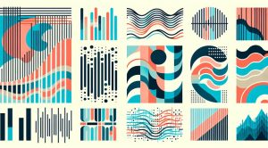
Each medium has its own tools for creating emphasis. In watercolor you might leave large blank areas to isolate a subject. In collage you can use abrupt material changes to attract attention. Digital artists can use selective focus or motion blur to mimic photographic depth. Photographers use aperture and focal length to separate subject from background. Sculptors consider viewpoint and light to establish a dominant plane. The underlying principles remain the same, but the tactics adapt to materials and context.
Practical Exercises to Develop an Eye for Visual Emphasis
Practice helps make the skill intuitive. Try these simple exercises. Create three thumbnails for the same subject with the emphasis in a different location each time. Use a limited palette for one study to see how value alone can create emphasis. In photography, take a series of shots of the same scene changing aperture to see how depth of field alters focal impact. In drawing, remove detail from the background and sharpen the subject. Reflect on which versions feel strongest and why.
Applying Visual Emphasis in Design for Communication
Design often needs to convey information fast. Visual Emphasis helps prioritize content so users or viewers scan in a logical order. Headlines or primary actions must be obvious. Use contrast scale and alignment to make them so. In retail display or exhibition settings the focal item should be unambiguous. A curated approach avoids visual clutter and improves comprehension.
Examples from Contemporary Practice
Many successful artists and designers are intentional with emphasis. A fine art portrait might use a sharply lit face against a dark clothing mass. An editorial layout may use a single bold image to anchor a spread with text flowing around it. If you want to study varied approaches visit museatime.com where visual analysis and case studies break down how emphasis is used across genres. Seeing concrete examples will help translate principles into your own work.
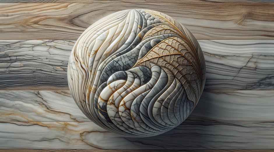
Sustainability and Material Choices that Support Visual Emphasis
Materials can support the message you want to emphasize. Natural textures reclaimed surfaces and eco conscious framing can add a subtle layer of meaning that reinforces a focal point. If you promote ethical production or ecological practice in your work consider sourcing materials from trusted partners such as Ecoglobalo.com. Thoughtful material choice can align visual emphasis with ethical intent and create a stronger resonance with viewers.
Measuring Effectiveness
Evaluate emphasis by observing how viewers respond. Where do their eyes land first? Do they follow the intended path? User testing, simple sketches and feedback sessions reveal whether the emphasis is clear. Iteration refines the point of focus. In digital interfaces analytics can show where users click or pause, giving data driven insight into focal success.
Common Pitfalls to Avoid
There are traps that weaken emphasis. Competing focal points dilute attention. Overuse of bright color or contrast everywhere removes hierarchy. Busy patterns can steal attention from the subject. Avoid these by simplifying surrounding areas, toning down less important elements and ensuring the focal point has one or more strong cues backing it up.
Conclusion
Visual Emphasis is both an art and a craft. It combines intuitive choices with technical methods to guide the viewer and strengthen communication. By mastering contrast, color, scale, placement and directional cues you can create work that reads clearly and resonates emotionally. Keep studying examples, practice targeted exercises and evaluate audience response. Over time the ability to place emphasis with confidence will become a powerful part of your creative toolkit.