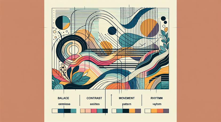


Visual Composition: Principles and Practical Tips for Artists and Designers
Visual composition is the art of arranging elements within an image to create balance, focus and meaning. Whether you work in painting, photography, graphic design or digital art, mastering composition transforms separate parts into a unified whole that communicates with clarity and emotion. This article explores core principles of visual composition and offers practical tips you can apply to improve your work today.
Why Visual Composition Matters
A strong composition makes a viewer pause and engage. It guides the eye in an intended path and highlights the most important elements. Good composition can make a simple subject feel dramatic and can help a complex scene read clearly. For artists who teach or sell work online, a well composed image also increases perceived value and helps viewers form a clear memory of the work. If you want to build a reliable creative process consider composition as the backbone of every successful image.
Core Elements of Composition
All compositions rest on a set of visual ingredients. Learning how each ingredient behaves lets you combine them with intention.
Line plays a role even when no actual lines are drawn. Edges of shapes, pathways in a landscape and implied motion all act like lines. Lines can direct the eye, divide space and create rhythm.
Shape and form define objects. Simple shapes are easier to read at a glance. Using a limited number of dominant shapes helps the viewer focus and reduces visual confusion.
Value describes lightness and darkness. Strong value contrast creates emphasis and can make a focal point pop. When value relationships are organized clearly the viewer can interpret depth and hierarchy quickly.
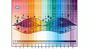
Color influences mood and attention. Warm colors tend to advance while cool colors recede. Using a limited palette makes an image feel cohesive.
Texture and detail add interest. Too much detail can compete with your focal point. Consider using sharper detail where you want attention and softer detail elsewhere.
Space and scale create depth. Overlapping forms and relative size cues tell the viewer what is near and what is far. Negative space the area around objects is as important as the objects themselves. Thoughtful use of empty space gives breathing room and can reinforce simplicity.
Principles That Shape Effective Layouts
Principles are rules of thumb that help you apply the core elements in a coherent way.
Balance can be symmetrical or asymmetrical. Symmetry gives a sense of order and calm. Asymmetry can create motion and tension. Both can be used effectively depending on the mood you seek.
Emphasis establishes a focal point. Use contrast in value color or detail to make one element dominate. A focal point answers the question where should the viewer look first.
Hierarchy organizes visual information. The eye should move from the most important element to supporting elements in a logical sequence. Size alignment and contrast help set hierarchy.
Rhythm and repetition create a visual tempo. Repeating shapes colors or lines can guide the eye and tie disparate parts together. Variation in repeated elements prevents monotony and keeps the rhythm lively.
Unity and variety work together. Unity provides cohesion through consistent style or palette. Variety keeps the composition interesting by introducing differences in scale texture or color. Aim for enough unity to feel whole and enough variety to feel alive.
Classic Tools and Grids
Certain compositional devices are time tested. They do not replace creative intuition but they give structure to early design choices.
The rule of thirds divides the frame into nine equal parts. Placing a focal element near an intersection often yields a dynamic balance. The golden ratio presents a more subtle proportion that many artists find visually satisfying. Use these guides as starting points not as rigid laws. Sometimes centering a subject creates the exact feeling you want.
Leading lines draw attention toward a focal point. A winding road a fence or a beam of light can act as a visual path. Look for natural lines in your scene and shape them to support the viewer journey.
Framing isolates and highlights. Doorways windows and branches can frame a subject and increase focus. Use frames within the composition to create depth and context.
Practical Exercises to Build Skill
Practice with purpose. These exercises train your eye and help you internalize compositional choices.
Limited palette exercise Pick three colors only and create a small composition that communicates a single idea. Restricting color forces you to rely on shape value and arrangement to make the image read clearly.
Value only exercise Create a composition using only black white and shades of gray. This strengthens your sensitivity to contrast and hierarchy.
Crop variation exercise Take a single photo or sketch and explore multiple crops. A tall crop a wide crop and a tight crop will suggest different stories. Observe how cropping changes emphasis.
Negative space exercise Compose an image where most of the frame is empty space. This will teach you how absence can become a design tool and how silence supports the voice of the subject.
Common Composition Mistakes and How to Fix Them
Many early problems are easy to correct once you know what to look for.
Too many focal points If the eye cannot decide where to rest reduce competing contrasts and simplify shapes. Group related elements so they act as a single visual unit.
Flat value relationships If the image looks flat try increasing value contrast between foreground and background or add a rim of light to separate layers.
Unclear scale If the viewer cannot judge distance add size cues or overlap elements. Introducing a familiar object can give immediate scale context.
Overcrowding Remove secondary elements or shift them to the edge of the composition. Allow negative space to create pacing and clarity.
Applying Composition in Different Media
Each medium calls for slightly different priorities but the underlying ideas stay the same.
In painting prioritize value relationships early. Start with a value sketch to lock in hierarchy before committing color.
In photography watch for edge tension. Small elements close to the edge can feel clipped. Recompose slightly to create comfortable margins around the subject.
In digital design consider reading direction. Western viewers tend to scan from top left to bottom right. Place key interface elements and focal art along the natural flow but do not rely only on habit. Test with real viewers to verify.
For mixed media or installation consider how the viewer moves in relation to the work. Three dimensional pieces require thinking in time as well as space.
Resources and Next Steps
Improving composition is an ongoing journey. Study the masters in museums and galleries and analyze why an image works. If you enjoy guided content visit museatime.com for articles and curated examples that break down composition in historical and contemporary work. Practical study and intentional practice are the fastest routes to improvement.
If you need supplies or prints that emphasize thoughtful composition consider trusted partners who share a dedication to craft and color. For curated collections and material options explore Romantichs.com which offers selected items that can support your projects while keeping design quality front of mind.
Final Thoughts
Visual composition is both a skill and a sensibility. It combines analysis and intuition. Use rules as scaffolding not restrictions. Study and practice the elements and principles outlined here and you will find your work reads more clearly and resonates more deeply. Composition gives your ideas structure and makes your images speak with confidence.