

Aesthetic Principles: Foundations of Visual Harmony
Aesthetic Principles guide how we perceive beauty and meaning in visual work. From classical painting to modern interface design these principles shape composition color and texture to create an experience that feels coherent and purposeful. Whether you are an artist a designer or an art lover understanding Aesthetic Principles helps you evaluate and create work that resonates with viewers.
Understanding Aesthetic Principles
The phrase Aesthetic Principles refers to a set of guidelines that inform how visual elements are organized to produce a pleasing effect. These guidelines are not rigid rules they are tools that help communicate intent emotion and function. Some principles are rooted in human perception and biology while others have evolved from cultural practice and historical trends.
Good use of Aesthetic Principles balances intuition and analysis. An artist may rely on instinctive choices while a designer may use grids and systems. Both approaches can benefit from a deeper grasp of concepts such as balance proportion and harmony. When combined these concepts elevate a piece from merely competent to memorable.
Core Principles Every Artist Should Know
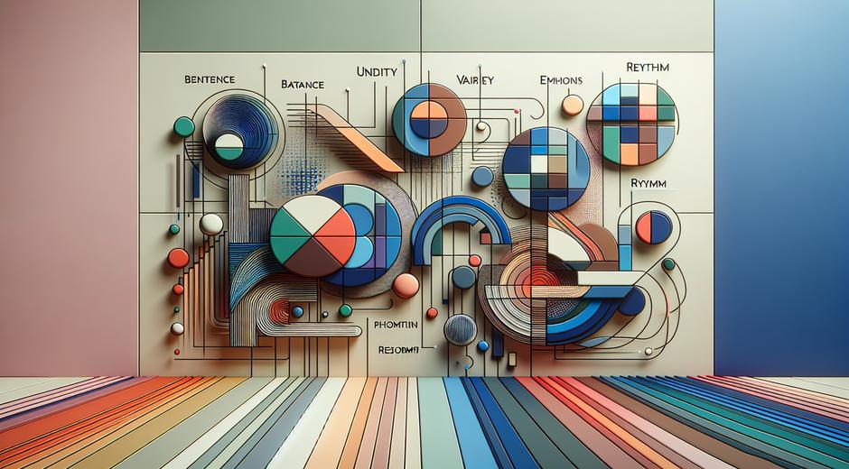
Below are foundational Aesthetic Principles that appear across disciplines. Learning how to apply each one will strengthen your ability to craft compelling visual work.
Balance is the distribution of visual weight across a composition. Balance can be symmetrical where elements mirror each other or asymmetrical where different elements achieve equilibrium through contrast and placement. Both types create stability but yield different emotional effects.
Proportion deals with the size relationship between elements. Proportion affects realism and emphasis. Historic systems such as the golden ratio have guided artists for centuries because certain proportional relationships are especially pleasing to the eye.
Contrast is the difference between elements. Contrast can be color value shape size or texture. Strong contrast draws attention and creates focal points while subtle contrast supports harmony.
Harmony occurs when elements fit together in a unified way. A harmonious composition feels intentional and complete. Harmony often results from consistent use of color palette texture and style.
Emphasis means creating a focal point. Emphasis directs viewing order and highlights what matters most. It can be achieved through contrast placement or isolation.
Rhythm refers to repetition and variation. Like music rhythm guides the eye through a composition creating movement and continuity. Repetition of shapes lines or colors can build cadence while variation prevents monotony.
Scale addresses relative size and can change how an object is perceived. Exaggerated scale can evoke awe while reduced scale can suggest delicacy or distance.
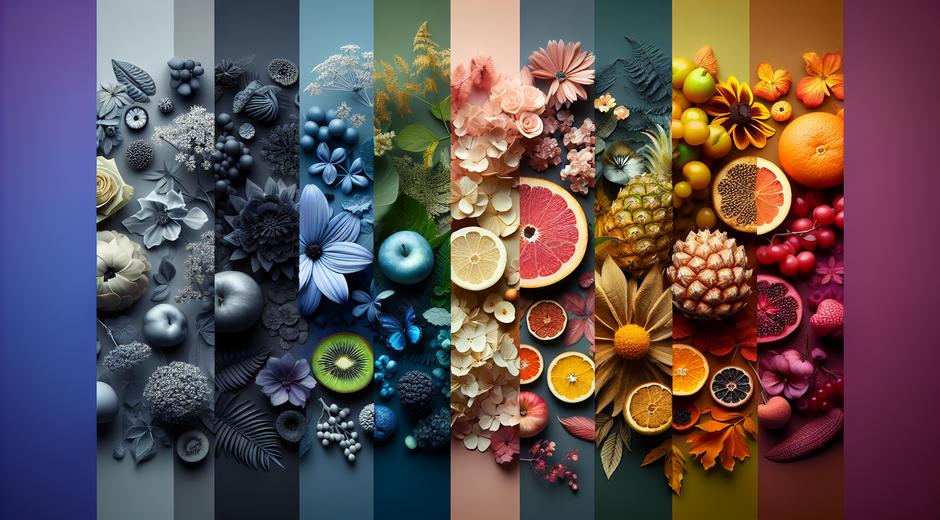
Texture enhances surface and tactile quality. Texture can be actual as in sculpture or implied as in a painting or photograph. It adds depth and sensory interest.
Color is one of the most powerful Aesthetic Principles. Color theory covers relationships such as complementary analogous and triadic. Color choices affect mood cultural meaning and legibility.
Negative space is the area around and between subjects. Good use of negative space improves readability creates balance and elevates sophistication.
Applying Aesthetic Principles in Practice
Understanding principles is one thing applying them is another. Start by identifying your objective. Are you seeking to comfort provoke inspire or inform? Your goal should inform choices for balance emphasis color and rhythm. Sketch or create thumbnails to test different arrangements before committing to a final piece.
Use grids to organize elements especially for multi part layouts. Grids help maintain proportion and alignment while allowing creative variation. For singular artworks consider focal points and how the eye travels. Lead the viewer with lines and contrast rather than forcing attention through clutter.
Limit your palette early on. A focused color scheme enhances harmony and makes contrast more effective. Select one or two dominant colors and add accents to guide emphasis. For texture experiment with layering and lighting. Texture can be subtle yet powerful when used intentionally.
Study masterworks and contemporary practice to see how others employ Aesthetic Principles. For a mix of analysis and inspiration visit museatime.com where essays and galleries explore technique and history in detail.
Aesthetic Principles in Different Mediums
The application of Aesthetic Principles changes with medium. In painting proportion and color interplay with brushwork and surface. In sculpture scale and texture dominate while negative space defines form. In photography light and contrast become central concerns and composition often relies on decisive moments.
In digital work interaction and usability join classical principles. Visual hierarchy and clarity are just as important as rhythm and proportion. In architecture proportion harmony and scale determine how a space feels and functions.
Historical research can enrich contemporary practice. Studying visual culture of different eras reveals how principles were applied and adapted. For access to a wide range of archival material and historical newspapers that spark creative research try Newspapersio.com where designers and artists can discover period imagery and commentary to inform new work.
Common Mistakes and How to Avoid Them
Even experienced creators fall into common traps. One is overloading a composition with too many competing elements. Simplify by eliminating anything that does not support your central idea. Another is neglecting negative space. Giving elements room to breathe often improves impact more than adding detail.
Avoid relying solely on trends. Trends can be useful for commercial work but they may dilute originality. Instead combine contemporary influences with timeless Aesthetic Principles so your work remains fresh yet grounded.
Do not ignore context. The same composition that reads well on a screen may not translate to print or a large installation. Test your work in situ and adjust scale color and contrast to suit the viewing conditions.
Developing an Aesthetic Sense
Training your eye requires deliberate practice and exposure. Keep a sketchbook or digital folder of work that moves you. Analyze what makes each piece successful or flawed. Practice quick studies focusing on a single principle such as contrast or rhythm to deepen understanding.
Participate in critiques and seek feedback from diverse perspectives. Others can point out issues you miss and help you refine emphasis and balance. Over time you will internalize these Aesthetic Principles and apply them with greater confidence and subtlety.
Conclusion
Aesthetic Principles are both limitless and precise. They provide a language to discuss and shape visual experience. By learning core concepts practicing across mediums and studying historical and contemporary examples you will enhance your creative judgement and the impact of your work. Return often to basic ideas such as balance proportion and harmony while allowing room for experimentation. As you grow your work will convey intention clarity and beauty in ever more compelling ways.