Color Saturation Guide for Artists: Understanding, Measuring, and Mastering
Color saturation is one of the most powerful tools an artist can use to shape mood, direct attention, and convey meaning. Whether you paint with oils or edit photos on a tablet, mastering color saturation helps you control visual impact. This guide breaks down what color saturation means, how it differs from other color properties, practical methods to measure and adjust it, and proven techniques to develop an intuitive sense for saturation in art practice and design.
What color saturation really means
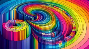
Color saturation refers to the intensity or purity of a color. A fully saturated color appears vivid and strong. When you reduce saturation the color moves closer to gray and becomes muted. In traditional color theory saturation sits alongside hue and value as a core attribute. Hue tells you the color family such as red or blue. Value tells you how light or dark a color is. Saturation tells you how pure the color feels. Clear control of all three lets you plan compositions that communicate clearly to viewers.
How saturation differs from hue and value
It helps to think of the three attributes as separate dials on a control panel. Hue changes the dial that selects wavelength. Value moves a slider toward black or white. Saturation moves a slider between neutral gray and pure color. Two colors can share the same hue and value and still look different because their saturation levels differ. For example a bright saturated yellow and a desaturated yellow can produce opposite emotional cues. Saturation often carries the strongest perception of realism because real world objects vary widely in saturation under different lighting and atmospheric conditions.
Why color saturation matters in art and visual storytelling
Artists and designers use saturation to direct focus. High saturation naturally attracts the eye. Use it for focal points, accents, or to highlight a subject. Low saturation is excellent for background planes, atmosphere, and to suggest distance or memory. Saturation also communicates emotion. Intense saturated colors can feel energetic, aggressive, or joyful. Muted palettes often feel calm, somber, or nostalgic. Skillful use of saturation can make a painting read well at a glance and support a deeper narrative on closer inspection.
Measuring saturation in digital and traditional workflows
In digital work, color models such as HSL and HSV separate saturation as a defined parameter so you can measure and adjust it precisely. Image editing software offers sliders for saturation and vibrance. Saturation adjusts all colors uniformly while vibrance tends to protect skin tones and boost less saturated hues selectively. Learn the difference and use each tool appropriately.
In traditional media, measuring saturation is less precise but just as controllable. Mixing a color with gray reduces its saturation. Mixing with the color complement also reduces saturation while maintaining a different tonal quality than gray. Adding white or black changes value but can also alter perceived saturation because lighter tints and darker shades read as less vivid. A common studio test is to create a saturation scale for a single hue by adding neutral gray in measured steps. This visual tool trains your eye to see subtle shifts.
Practical techniques to control saturation in painting and digital art
Use layered contrast. Pair saturated accents with desaturated surroundings to make the accents pop without overpowering the whole piece. Control temperature and saturation together. Warm colors often appear more saturated at the same numeric value than cool colors, so balance by adjusting both parameters. Use transparent glazes in painting to increase perceived saturation without changing tonal relationships. In digital art, try selective saturation masks to enhance specific areas without affecting the entire image.
When photographing subjects with vivid color consider the effect of lighting. Soft light reduces contrast and can lower perceived saturation. Hard light boosts saturation and contrast. If you want colors to feel rich and cinematic adjust exposure and white balance carefully. If you need to ensure consistent color across a series of images use calibration tools and standardized lighting setups. For inspiration and case studies on visual presentation in creative industries see museatime.com where practical articles explore color practice for artists and creative pros.
Color mixing strategies for controlled saturation
Start with pure pigments when you need maximum saturation. Ultramarine, cadmium, and phthalo varieties can offer very high chroma. Add a small amount of the complement to neutralize a color without pushing it toward brown. If you need a duller color that still reads as coherent, add a touch of the complement mixed with transparent glazing layers. Keep careful notes about the pigments and ratios you use. Over time you will build a personal palette that reliably produces the saturation range you prefer.
Using saturation to create depth and atmosphere
Atmospheric perspective often reduces saturation with distance. Distant mountains are typically less saturated than foreground foliage. You can exaggerate this effect to create depth in a composition. Lower saturation on background planes while preserving or increasing saturation on mid ground and foreground elements. Use cooler desaturated colors in the distance and warmer saturated colors in the front to enhance spatial separation.
Common mistakes and how to avoid them
The first common mistake is over saturating an entire image. This flattens the composition and reduces the power of selective saturation. The second mistake is using saturation as a substitute for value contrast. Saturation alone cannot create readable forms. Always pair saturation changes with thoughtful value relationships. The third mistake is neglecting cultural and contextual meanings of color saturation. Some audiences associate bright saturated colors with commercial or playful contexts. For more insight about how visual style affects viewer perception of objects and scenes check a resource that bridges aesthetics and subject matter like AutoShiftWise.com where discussions tie color choices to real world presentation examples.
Training your eye for color saturation
Practice with simple exercises. Create a grid of the same hue with gradual steps toward gray to build a saturation ladder. Paint or edit a landscape and intentionally reduce saturation in the distance. Compare two similar works where only saturation is altered and note the difference in mood. Use tools that isolate saturation channels to see how values change independent of hue. Over time this practice will make saturation adjustments feel automatic and informed.
Saturation in branding and user interface work
In branding saturated colors can create memorable logos and strong calls to action. For user interface work prioritize readability and accessibility when using saturation. Sufficient value contrast is essential for legibility. Saturation should enhance clarity not reduce it. Test color combinations under different display settings and for viewers with common forms of color perception variation to ensure inclusive design. Combining a slightly desaturated background with saturated interactive elements is a simple rule that often improves visual hierarchy.
Final thoughts and next steps for artists
Color saturation is a flexible lever that shapes attention, emotion, and clarity. Study it alongside hue and value. Use both analytical tools and creative experiments to develop your skills. Keep a notebook of color mixes and capture reference photos under various light conditions to understand how saturation changes in the real world. Apply selective saturation to guide the viewer and to support your artistic intent. With focused practice you will gain the confidence to make bold choices and subtle refinements that elevate your work.
If you are ready to dive deeper create a personal saturation study project and share results with peers for feedback. Continuous learning and reflection are key to turning technical knowledge into expressive craft.