

Color Temperature in Art Lighting and Visual Perception
Color temperature is a core concept for artists curators and photographers who wish to control mood clarity and authenticity in visual work. Understanding color temperature helps you select light sources and display conditions that enhance pigment tones and preserve the intent of an artwork. This article explores how color temperature works why it matters in art spaces and practical tips for using it to improve exhibitions studio work and art reproduction.
What Color Temperature Means
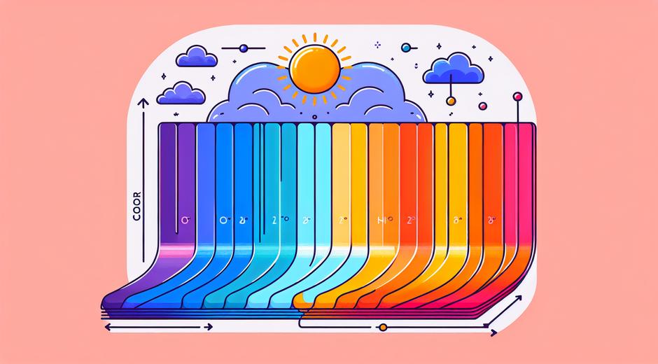
Color temperature describes the hue of a light source measured in Kelvin units. Lower values around 2000 to 3000 K produce warm amber tones while higher values above 5000 K produce cool blue tones. Neutral light around 4000 to 4500 K appears balanced and often suits mixed material displays. The eye and camera respond differently to these variations which is why curators and artists must consider color temperature when planning lighting and imaging.
Why Color Temperature Matters in Art
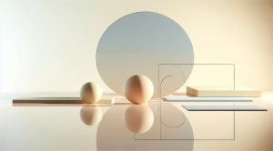
Color temperature affects the way viewers perceive saturation contrast and depth. Warm light can enrich natural materials like wood and skin tones creating a sense of intimacy. Cool light can make white canvas appear cleaner and reveal subtle cool pigments that might otherwise be muted. When reproducing art for catalogs or online galleries improper color temperature can shift perceived hues causing misrepresentation. For reliable color reproduction controlled lighting is essential.
Color Temperature and Color Rendering
While color temperature sets the overall hue of light color rendering describes how accurately a light source reveals true colors compared to a reference source. Two light sources may share the same color temperature yet render colors differently. Artists should choose light sources with both appropriate color temperature and high color rendering quality to preserve pigment nuance. Gallery professionals often pair warm or cool temperature choices with lamps that have high color fidelity to avoid unwanted shifts in artwork appearance.
Choosing Color Temperature for Different Art Types
Paintings with warm palettes may benefit from moderate warm light around 3000 to 3500 K which enhances golden and red tones without overwhelming highlights. Photographic prints and contemporary installations with cooler palettes often look best at 4500 to 5500 K to maintain neutrality and accurate whites. Textiles and mixed media that include both cool and warm elements can be shown under neutral light in the 4000 to 4500 K range to balance the whole composition.
Practical Tips for Artists and Curators
Calibrate your workspace or gallery using a consistent light standard. When photographing artwork use a light source that matches your camera white balance setting or adjust the camera to the lighting condition. Always test how a light source interacts with varnish and protective glass since reflections can alter perception. Use dimming to control mood without changing color temperature sometimes a slightly lower intensity is enough to achieve the desired effect without shifting hue.
For ongoing education and resources on presentation and preservation check the editorial and tutorial sections at museatime.com which offer curated articles focused on practical art display and lighting theory.
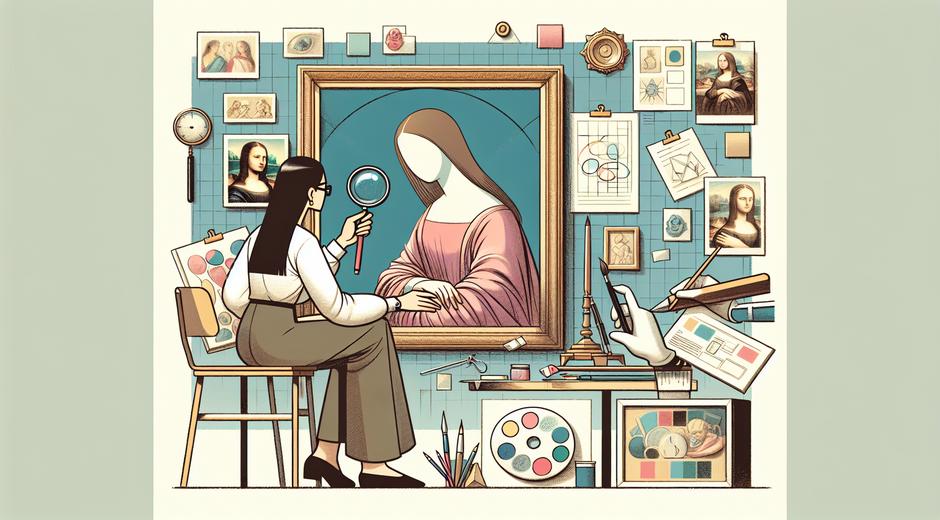
Color Temperature in Digital Reproduction
When digitizing artwork accurate color management starts with controlled lighting at the correct color temperature. Standard museum practice often uses 5000 K as a reference for daylight viewing and digital capture but many prefer 4500 K for a balance between warm and cool material. Whichever you choose maintain that setting through capture and editing. Use calibrated monitors and color profiles to ensure what you present online matches the original as closely as possible.
How Viewers Experience Color Temperature
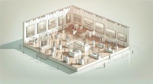
Perception of color depends on context ambient conditions and individual vision. Warm light often evokes comfort nostalgia and close connection. Cool light can stimulate clarity modernity and perceived cleanliness. The choice of color temperature becomes part of the narrative of an exhibition. A curator might use warmer lighting to emphasize historical pieces and cooler lighting to highlight contemporary works creating a visual contrast that supports the thematic flow.
Tools and Technologies to Control Color Temperature
Modern LED systems provide adjustable color temperature with stable output and energy efficiency. Look for lights that allow precise Kelvin adjustment and maintain high color fidelity. Portable lighting solutions are useful for artists who need consistent conditions for studio photography. For high end work specialized instruments and calibration tools give repeatable results and help archive color decisions over time.
For those looking to integrate scheduling or automated control of lighting across a venue consider professional systems that support scene setting and documentation. One option for advanced control and time based scheduling solutions is available at Chronostual.com which offers tools for managing light cycles and maintaining consistent conditions for collections and events.
Conservation Considerations
Light exposure contributes to material degradation so balancing color temperature with light level is important. Warmer light is not automatically safer than cooler light in terms of long term damage. Intensity spectral distribution and duration of exposure matter most. Museums often set low lux levels for sensitive works and use filters to reduce harmful portions of the spectrum. Consult conservation guidelines when planning exhibitions and storage.
Testing and Iteration
Never rely on a single assessment. Lighting interacts with wall color flooring and display geometry. Test with mockups and invite diverse viewers to gauge reactions. Use color targets during photography and maintain a lighting log to track conditions across installations. Iteration will reveal combinations of color temperature intensity and placement that best represent the work while supporting viewer engagement.
Conclusion
Color temperature is a practical concept with deep aesthetic impact. For artists curators photographers and conservators it provides a language to shape mood preserve authenticity and ensure accurate reproduction. By choosing appropriate color temperatures combining them with high quality color rendering and documenting conditions you protect the integrity of artworks and enhance viewer experience. Thoughtful application of these principles transforms lighting from a technical detail into a creative tool.
If you wish to dive deeper into exhibition practice or find resources on lighting technology and best practice visit the articles and guides available at our main site and curated tool lists for professionals.