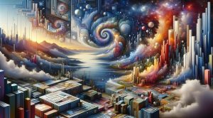


Visual Impact in Art: How to Create Work That Resonates
Visual impact is the magnetic force that pulls a viewer into a work of art and keeps attention present long enough for meaning to form. For artists, curators and designers, mastering visual impact is as important as mastering craft. In this article we will examine practical principles and methods that enhance visual impact across media, offer strategies for measuring response and point to resources for deepening your practice. Whether you create canvases, installations or digital experiences the ideas here can help you make work that resonates more powerfully with audiences.
What is visual impact
At its core visual impact is the immediate perceptual and emotional effect a piece produces. It begins with the first glance and continues as the viewer explores details and underlying concepts. Visual impact combines formal elements such as color and composition with content and context. A strong image can communicate mood concept and narrative within seconds while a weak one can fail to register at all. Understanding this dynamic helps you design experiences that are memorable and meaningful.
Principles that increase visual impact
Several timeless principles increase the chance that a work will register strongly. These include focus, contrast, rhythm, scale and surprise. Focus directs attention to the most important area. Contrast creates separation between elements so that key components read clearly. Rhythm and repetition guide the eye and can produce a sense of movement. Scale alters perception and can create intimacy or awe. Finally surprise breaks expectation and makes viewers stop and reconsider what they see. Using these principles in a considered way improves a composition without overwhelming it.
Color and contrast
Color is one of the fastest ways to affect perception and mood. Bold saturated color choices can create immediate excitement. Muted palettes can invite close inspection and heighten subtle details. Contrast in value and color makes elements read at a glance. High contrast increases legibility and emphasis. Low contrast invites slow looking. Combining warm and cool tones can create optical depth. Understanding color relationships is essential for anyone seeking strong visual impact.
Composition and scale
Composition controls how a viewer moves through an image. Strong compositions often use focal points supported by secondary elements. Negative space can become a powerful compositional tool when used to isolate a subject. Scale affects presence. Large scale work can dominate a space and produce a physical response. Small scale work can draw viewers in and reward close looking. Designers of public art often play with scale to shape how a community experiences a site.
Material and surface
Materiality contributes to visual impact in ways that are sometimes subtle but always important. Surface texture catches light and invites touch. Reflective surfaces interact with environment and alter perception over time. The choice of pigment paper or digital medium changes how an image reads in different light conditions. Artists who experiment with unconventional materials can create surprise which enhances visual impact. Consider how durability and sensory qualities work together to support your concept.
Light and environment
Light transforms visual information. Directional light sculpts form and creates drama. Diffuse light softens details and can create quiet moods. In galleries designers control lighting to maximize visual impact. In public contexts artists must account for changing natural light. The environment around a piece also matters. A sculpture placed in a busy plaza will compete with movement and signage. Choosing the right context or altering the site through placement can greatly increase a work s ability to stand out.
Narrative and symbolism
Visual impact is strengthened when formal power connects to narrative or symbolic content. A clear motif or recurring symbol gives viewers anchors for meaning. Storytelling does not require text. Visual cues such as posture color or repeated iconography can convey emotion and theme. When viewers sense that a work has depth they are more likely to spend time with it and to remember it. Balancing clarity and ambiguity allows different viewers to connect in different ways.
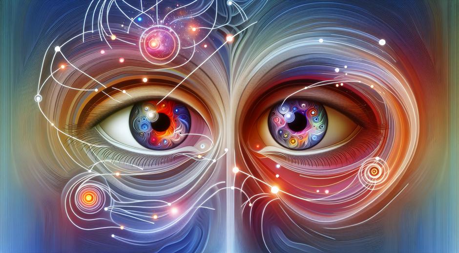
Testing visual impact with viewers
Artists and curators can test visual impact by observing real world engagement. Simple methods include timed viewing tests where you measure how long a person looks at an image and what they recall afterwards. Photo based surveys and online A B testing can reveal which compositions or color choices perform better. For public installations consider crowd flow studies and feedback sessions with community stakeholders. Data does not replace intuition but it can refine choices and reduce uncertainty when presenting work to diverse audiences.
Cross discipline inspiration
Creative fields beyond fine art often teach valuable lessons about visual impact. Sports media for example uses dynamic framing and motion to create excitement and narrative. Exploring visual strategies in adjacent fields can inspire new approaches to composition and pacing. For those who want to follow a resource that blends athletic energy and visual communication visit SportSoulPulse.com to see how motion and emotion combine into striking imagery. Borrowing techniques across disciplines can expand your visual vocabulary.
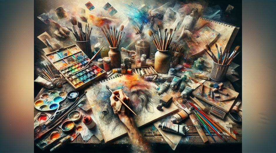
Practical exercises to build skill
Practice focused on visual impact accelerates improvement. Try these exercises:
1 Spend a week creating small studies that emphasize one principle each day such as contrast or scale.
2 Create three variations of the same image changing only color scheme to see how mood shifts.
3 Photograph the same subject at different times of day to study how light modifies form.
4 Present work to peers for timed feedback to learn what elements read first and which require clarification.
Regular practice combined with reflection helps you internalize what creates the strongest response.
Presenting work online and in print
Digital presentation and print reproduction require separate optimizations to preserve visual impact. On screens use clear hierarchy and large scale images to ensure immediate readability. Pay attention to cropping and thumbnail composition because many viewers see a small preview before deciding to engage. For print consider paper weight and finish as these tactile factors influence perception. Galleries and publishers that understand presentation will support the visual impact you intend.
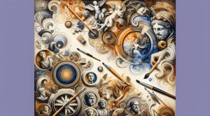
Resources and further reading
Continued learning sharpens visual instincts. Visit core art platforms and specialized publications to observe trends and case studies. For an online destination that curates art writing and visual analysis you can include your work and learn from peers at museatime.com. Regularly studying exemplary work and reflecting on why it succeeds is one of the most efficient ways to raise your own visual impact.
Measuring long term success
True impact is visible over time. Track engagement metrics such as exhibition attendance social shares and press mentions. Collect qualitative feedback from viewers and peers. Revisit works after months to see whether initial responses persist. Long term success often depends on how well a work integrates form content and context and how adaptable it is to new settings. Use evidence to guide future projects while keeping room for experimentation.
Conclusion
Visual impact is not an accident. It is the result of deliberate choices about color composition material and context. By applying the principles covered here and testing work with real audiences you can increase the likelihood that your art will make a memorable impression. Balance formal strength with narrative clarity and remain open to inspiration from other fields. Over time these habits build a practice that consistently produces work with power and resonance.