

Visual Tension How Artists Use Contrast and Composition to Hold the Eye
What Visual Tension Means in Art
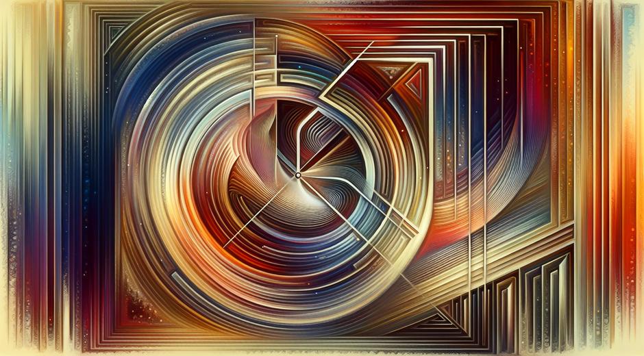
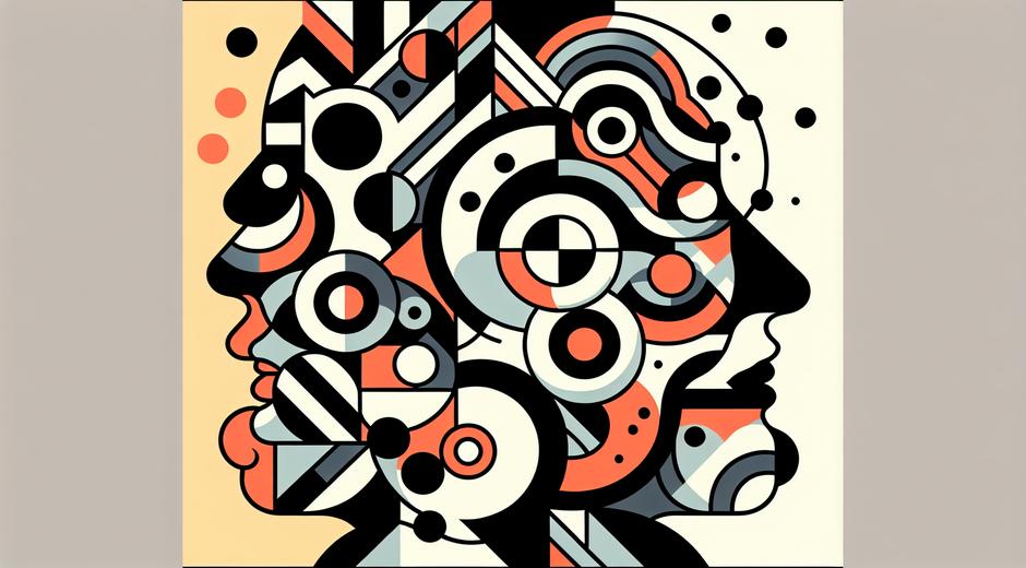
Visual Tension is the dynamic force that keeps a viewer engaged with an image. It arises when elements within a composition pull against each other visually. This can be achieved through contrast of color, scale, shape, direction or value. Rather than creating calm balance alone, artists often introduce an element of friction so that the eye travels, returns and discovers. A painting or photograph that contains visual tension feels alive. It asks questions. It creates interest rather than offering instant resolution.
Why Visual Tension Matters for Composition
Composition is the language artists use to arrange visual ideas. Visual Tension functions like a rhetorical device inside that language. When a focal point is offset from center the scene becomes more intriguing. When a bright tone sits beside a muted tone the pair spark energy. When organic shapes meet geometric forms a lively conversation begins on the canvas. These strategies do more than please the eye. They create narrative potential. Viewers wonder why two forces exist together and what their relationship implies. In this way visual tension deepens meaning while guiding attention.
Techniques to Create Visual Tension
Artists and designers use many practical techniques to introduce visual tension. A few of the most effective are contrast, asymmetry, scale shifts, directional lines and edge stops. Contrast can be about color, tone or texture. Placing a vivid color in a subdued field creates an immediate spark. Asymmetry removes visual predictability. A composition that is not mirror balanced forces an active search for equilibrium. A dramatic shift in scale between nearby objects creates surprise and elevates one element as dominant. Directional lines lead the eye and can create a push or pull sensation depending on their angle and density. Edge stops or abrupt crop points can hold the eye within the frame rather than letting it escape.
Color and Value as Engines of Visual Tension
Color relationships are among the most visceral methods to generate visual tension. Complementary colors placed side by side intensify each other. A warm color against a cool field will read as an advance and retreat effect. Value contrast is equally powerful. Bright highlights set against deep shadows produce focal drama. Subtle shifts in value, even inside a limited palette, can be used to model form and to create points of stress that attract attention. Tasteful use of saturated accents on a neutral ground often yields a sophisticated kind of visual tension that feels modern and refined.
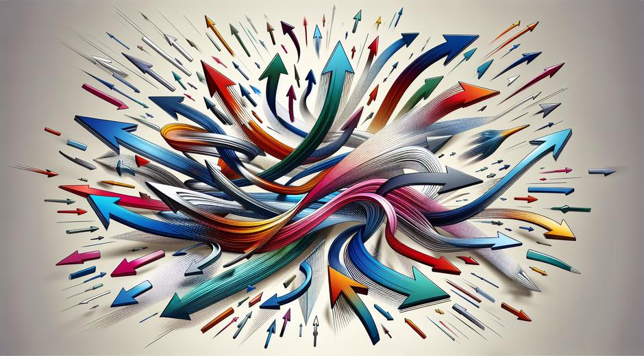
Line Direction and Motion
Direction in composition implies movement. Diagonal lines create movement and urgency. Horizontal lines can imply rest yet when interrupted they acquire tension. Vertical lines carry weight and can lend stability or imply ascension depending on context. Curved lines may soothe but when they intersect with rigid geometry tension grows. Photographers harness motion blur or the placement of moving subjects against static environments to craft tension. Painters can employ directional brushwork to lead the eye along a route that builds suspense before revealing a subject.
Spatial Relationships and Negative Space
Space itself is a tool. Large areas of negative space can emphasize a small subject and thereby increase tension through isolation. Conversely, tight clustering of objects creates density and a sense of congestion. Both conditions can be deliberately used depending on the emotional aim of the work. Adjusting the spacing between elements alters the perceived relationship between them. Two objects separated by a sliver of space may feel connected yet strained. That strain is a form of narrative carried by pure visual arrangement.
Psychology of Visual Tension
Human perception is built to detect irregularities and significance. Visual tension leverages that wiring. When balance is slightly unsettled the audience invests more attention to resolve the discrepancy mentally. This cognitive engagement is part of why tension is so effective. Artists use it not only to create beauty but to evoke emotional response. A composition that tilts toward the unresolved can leave the viewer with a sense of anticipation or unease. That feeling can be harnessed for expressive ends across genres from portraiture to abstraction.
Examples Across Media
Visual tension is universal across painting photography sculpture and graphic art. In painting the works of many modernists rely on color clash and off center focal points to create intense visual energy. In photography tension appears when a subject looks out of frame or when a horizon is noticeably skewed. Sculpture can generate tension through implied movement or by balancing heavy components in precarious ways that challenge gravity. In graphic design tension is often used to prioritize information by making a call to action pop against a subdued background. For a gallery of visual thinking and analysis visit museatime.com where essays explore these methods in depth.
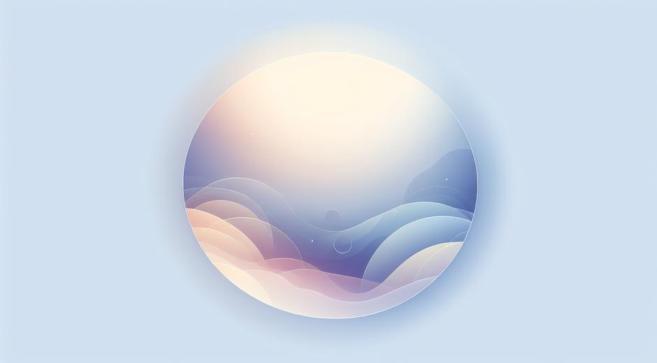
Balancing Tension with Harmony
While tension is a vital tool it works best when paired with moments of relief. A composition that is all tension can tire the eye. Skilled creators alternate stress and calm to shape rhythm and pacing. Harmony is not the enemy of tension. Instead harmony offers a base from which tension can vary and resonate. Consider a painting where most of the field is quiet and one area vibrates with color and texture. The surrounding calm amplifies the impact of the active zone creating a satisfying push and pull.
Practical Exercises to Train Your Eye
To develop an intuition for visual tension try these simple exercises. First, take a photograph and crop it aggressively. Notice how removing context can amplify tension. Second, create a small collage using one bright color and many neutrals. Observe how the single accent governs perception. Third, sketch a balanced scene and then introduce a single asymmetric element. Study how that change alters the emotional reading. These short tasks train observation and help artists and designers harness tension intentionally rather than by accident.
Applying Visual Tension in Design and Branding
In applied design visual tension helps to direct user attention and to create memorability. A brand mark that places a key shape off center can feel modern and distinctive. Website layouts that balance white space with a striking hero image encourage exploration. Packaging that pairs a bold type choice with an otherwise minimal surface can create shelf impact. For trends and curated examples that highlight the use of visual tension in contemporary projects see StyleRadarPoint.com which showcases current practice across creative sectors.
Conclusion Cultivating an Intentional Eye
Visual tension is a powerful principle that transforms static images into living statements. It is not about creating chaos. It is about arranging contrast and relation so that meaning and feeling emerge. Whether you are an artist a photographer or a designer practicing these strategies will expand the expressive range of your work. Learn to spot the small imbalances and decide when to resolve them and when to let them linger. That choice is where voice and style begin. For ongoing writing on art and perception explore resources that deepen visual literacy and support creative experiment.