

Understanding Tone in Visual Art A Practical Guide for Creators and Collectors
What Tone Means in the Language of Art
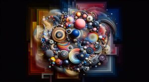
Tone is a foundational concept in visual art that shapes how an image feels and how it communicates with a viewer. In simple terms tone refers to the relative lightness or darkness of colors and how those variations create depth contrast and mood. Artists use tone to model form guide the eye and to convey emotion without relying on line or color alone. Whether you work in painting drawing photography printmaking or digital media learning to control tone can transform your work from flat to expressive.
Tone Versus Color and Value Why the Distinction Matters
Many people confuse tone with color or with value yet they are related and distinct ideas. Color describes hue such as red blue or green. Value describes the lightness or darkness of a color. Tone sits at the intersection of these ideas and refers to the perceived mood created by a set of values and colors working together. A warm tone might evoke comfort while a cool tone can suggest distance or calm. Paying attention to tone helps you make choices about palette composition and lighting that support the concept behind a work.
How Tone Shapes Composition and Focus
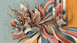
Tone is an essential tool for composition. By varying tonal contrast you control where a viewer looks first and how the eye moves across an image. High contrast areas tend to attract attention while low contrast zones support quiet or negative space. Strategic tonal relationships can create a focal point even when color contrast is subtle. For example a portrait with a softly lit face set against a darker background uses tone to lift the subject off the canvas. Similarly a landscape can suggest distance by progressively lightening tones toward the horizon to mimic atmospheric perspective.
Techniques to Develop Tonal Sensitivity
Improving your sense of tone takes practice and a set of focused exercises. Start by reducing an image to a limited tonal range by squinting or by working in grayscale. Create value studies that map the darkest midtone and lightest values across a composition. Limit your palette to a few colors or a single hue mixed with white and black to explore how subtle shifts influence mood. Another effective method is to work from life under consistent lighting. Observe cast shadows core shadows highlights and reflected light. Over time these practices make tonal decisions faster and more intuitive.
Tone in Different Mediums How Approach Varies
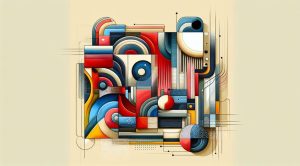
Each medium offers unique opportunities for tone. In oil painting glazing can add depth by layering translucent tones. In watercolor the paper often provides the lightest tone and washes build midtones and shadows. Charcoal and graphite excel at tonal modeling due to their ability to render a wide range of values quickly. Digital tools provide adjustable layers and blending modes that mimic traditional methods while offering undo and filter options. Regardless of medium the same principles apply: define planes with tone create contrast for focus and maintain unity across the piece.
Using Tone to Convey Emotion and Narrative
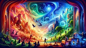
Beyond form and clarity tone is a direct pathway to emotion. Gloomy tones with deep shadows and muted highlights can communicate melancholy or suspense. Bright high key tones with minimal shadow often feel optimistic or ethereal. Many cinematic images rely on tone to set a scene before any action takes place. Consider how a single tonal shift can change the narrative of a painting or photo. An evening scene rendered with cool desaturated tones reads differently than the same scene warmed with golden highlights. Artists who master tone gain a powerful voice for storytelling.
Practical Tips for Applying Tone in Studio and Field Work
Keep a small notebook or sketchbook for tonal studies. Use quick thumbnail sketches to map key values. When photographing a scene bracket your exposures to capture details in both shadows and highlights. In the studio test small color mixes to check how they read in terms of tone before applying them to a large surface. If you teach or critique work emphasize tonal clarity as a priority before refining details. This approach prevents overworking and preserves spontaneity while ensuring structural integrity.
Tone in Curation and Presentation
Collectors curators and gallery staff also respond to tone when arranging exhibitions. A group of works with cohesive tonal relationships can create a resonant viewing experience. Lighting in a gallery is critical because it alters perceived tone and can either enhance the artist intent or obscure it. When preparing a portfolio consider how prints or reproductions retain tonal fidelity across different viewing conditions. Museums and private collectors alike appreciate artists who understand how their works will function under display lighting.
Learning from Masters How Tone Defines Style
Studying Masters can reveal distinct tonal signatures that define a career. The high contrast chiaroscuro of certain painters emphasizes drama and three dimensionality. Other artists prefer a flattened tonal harmony that supports pattern and decorative effect. By analyzing how respected works handle midtones highlights and shadow you can adapt methods into your own practice. Visit galleries read catalog essays and practice replicating the tonal architecture of pieces you admire. This exercise is not for copying but for understanding choices that led to memorable outcomes.
Connecting Tone to Audience and Context
Think about tone in relation to who will see a work and where it will hang. Commercial projects might demand clarity and legibility favoring higher contrast. Commissioned portraits for families often call for flattering midtones and soft transitions. Public art needs durability in various light conditions so tonal robustness matters. When planning a body of work consider how consistent tone across pieces can strengthen a project theme and enhance recognition. For resources on presenting art and cultural travel inspiration visit TripBeyondTravel.com where curated journeys often highlight tonal qualities of landscape and architecture that inspire creative practice.
Bringing Tone to Your Creative Practice Today
Start a deliberate study of tone this month by committing to a series of small monochrome pieces. Document your progress photograph your value studies and review them in a group or with a mentor. Reflect on how tone influences your intent and how viewers respond. If you want ongoing insights and articles about art technique composition and exhibition trends return to our archive at museatime.com where we explore topics that support your growth as an artist or as a collector.
Conclusion Tone as a Key to Visual Communication
Mastering tone elevates technical skill and opens expressive possibilities. It influences perception guides attention and shapes emotion. By practicing tone through focused studies and by observing how light interacts with form you can make bolder clearer and more evocative work. Tone is not just a tool for artists it is a language that viewers instinctively read. Learn it refine it and let it become part of your visual vocabulary.