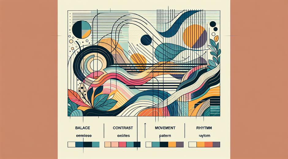


Spatial Balance How Artists and Designers Create Visual Harmony
Spatial Balance is a core principle in art and design that guides how elements are arranged to achieve a sense of stability and harmony within a composition. Whether you are a painter sculptor photographer or interior designer understanding Spatial Balance helps you control visual weight guide viewers eye and produce work that feels complete rather than chaotic. This article explores the theory behind Spatial Balance shows practical methods to achieve it and offers exercises and examples to inspire your next project.
What Spatial Balance Means in Visual Practice
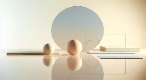
At its heart Spatial Balance is about distributing visual weight across a surface or volume so that the viewer perceives the composition as unified. Visual weight is not physical mass but a perception influenced by size value color complexity texture and placement. A large bright object can carry more visual weight than several small muted objects even if those objects cover more actual area. Achieving balance does not always mean creating perfect symmetry. Many powerful works use asymmetry to create dynamic yet stable arrangements.
Core Types of Spatial Balance
Artists and designers rely on several basic balance strategies. Knowing these allows you to choose the approach that best serves the concept of a work.
Symmetrical Balance: The simplest and most literal approach to Spatial Balance places elements evenly around a center axis like a mirror. Symmetry communicates formality calm and order. Portraiture and architectural facades often use symmetry to convey dignity and permanence.
Asymmetrical Balance: This method balances dissimilar elements by matching their perceived visual weight rather than their size or shape. A small vibrant object can balance a large muted area if it draws more attention. Asymmetry is subtle and versatile it can suggest movement and tension while still feeling stable when well composed.
Radial Balance: Radial balance arranges elements around a central point creating a sense of rotation or emanation. This is common in mandalas rosette windows and some floral compositions. Radial arrangements invite viewers to move their gaze around the center offering a ritual or meditative quality.
How Color and Value Affect Spatial Balance
Color temperature and contrast play a major role in Spatial Balance. Warm colors such as reds and oranges advance toward the eye and therefore hold stronger visual weight than cool colors such as blues and greens that appear to recede. High contrast areas attract attention more than low contrast zones. A dark small shape on a light background can balance a large light area on a dark background. Paying attention to these interactions lets you manipulate balance without changing the actual layout significantly.
Using Texture Scale and Negative Space
Texture increases perceived weight because complex surfaces draw attention. Fine detail concentrated in one region can counterbalance a broad empty field elsewhere. Scale is also crucial large elements often dominate but a cluster of smaller elements can approximate the weight of a single larger one if arranged intentionally. Negative space is not empty it is an active part of composition. Generous negative space can balance busy areas and provide breathing room. Learning to treat empty space as a design element is essential to mastering Spatial Balance.
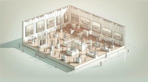
Spatial Balance in Installation and Site Specific Work
When art moves into three dimensional space and to a site the concept of Spatial Balance expands to include viewer movement and environmental context. An installation interacts with architecture light and viewer path. Artists must consider how objects relate vertically and horizontally and how shadows and sightlines influence balance. Successful installation work often balances mass across a room or along a corridor to create a cohesive experience. For those who document installations a well balanced photograph can communicate the original experience more effectively.
Practical Exercises to Train Your Eye
Exercise One Rearrange objects on a tabletop using three to five items Aim to create three different balanced compositions using symmetrical asymmetrical and radial strategies to compare how each feels. Focus on color value and negative space more than exact placement.
Exercise Two Create a collage from magazine cutouts Use a single focal image and then balance it with smaller cutouts that vary in color and texture. Experiment with placing these on different margins and corners and observe how balance shifts.
Exercise Three Photograph a room or a street scene and crop it into three different versions Each crop should demonstrate a different type of Spatial Balance Pay attention to how the eye moves across each version and which feels most stable.
Famous Examples of Spatial Balance in Art
Many classic and contemporary works showcase masterful use of Spatial Balance. Renaissance altarpieces often rely on symmetrical arrangements to frame religious subjects. Impressionist compositions frequently use asymmetry to capture fleeting moments while maintaining cohesion through careful value and color relationships. Contemporary installation artists may use radial layouts to create immersive environments that feel centered and intentional. Studying these works helps translate historical methods into current practice.
Applying Spatial Balance in Design and Architecture
Designers and architects use Spatial Balance to shape user experience. In interior design balanced arrangements influence how a room feels whether it is restful energetic or formal. Graphic designers balance type and image to guide reading paths. Architects balance mass and void to shape sunlight and movement. In every case Spatial Balance becomes a tool for shaping perception and function simultaneously.
Bringing Theory into Studio Practice
Start projects with quick thumbnails to explore balance options before committing to full scale work. Use grayscale studies to focus on value relationships without being distracted by color. Move elements around physically in a studio or digitally when possible and document each variant to see which composition best supports your message. Over time you will develop an intuitive sense for how to distribute visual weight effectively.
Resources and Further Inspiration
If you want to explore articles essays and curated galleries that discuss composition and Spatial Balance start by visiting museatime.com where a variety of features examine technique and history across media. For artists looking to reach wider audiences or to place press materials consider platforms that specialize in distribution and outreach one popular option is Newspapersio.com which offers tools for promotion and media placement.
Conclusion Mastering Spatial Balance
Spatial Balance is both a practical tool and a creative challenge. It asks artists and designers to think about how elements relate to each other and to the viewer. By studying types of balance practicing with hands on exercises and observing how established works handle weight color and space you can strengthen your compositions and communicate ideas more clearly. The ability to create equilibrium while retaining energy separates technically competent work from memorable work. Keep experimenting and let Spatial Balance guide the clarity and impact of your creative voice.