

Value Range in Art: A Guide to Tonal Control and Market Perception
What value range means for artists
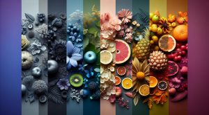
Value range refers to the spectrum of lightness to darkness within a work of art. It is a core concept in drawing painting and digital art because it determines how forms read at a glance. When an artist understands value range they control contrast atmosphere depth and legibility. In pictorial terms value is distinct from color hue and from saturation. A scene may be highly colorful yet have a narrow value range making shapes read flat. Conversely a monochrome study with a broad value range can feel dramatic three dimensional and clear.
Why mastering value range matters
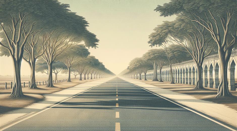
Visual clarity is a product of the value choices an artist makes. A strong value range can guide a viewer eye toward the focal point create depth and reinforce narrative tension. In composition a clear separation between lights midtones and darks aids readability. In addition value range plays a role in emotional tone. High contrast scenes that emphasize extremes of light and dark often feel intense urgent or cinematic. Low contrast scenes with compressed value range tend to feel calm intimate or misty. Mastering value range gives artists a versatile tool to shape viewer response.
The elements of value range
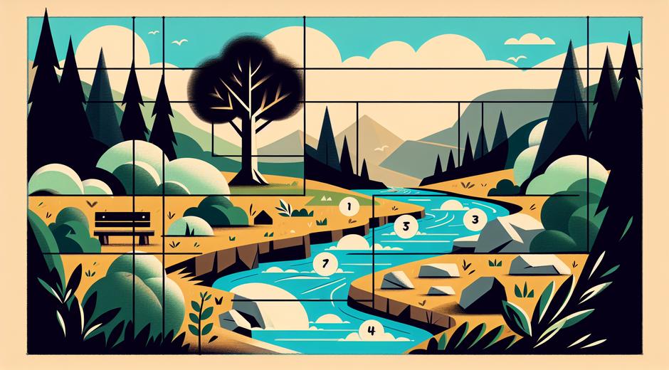
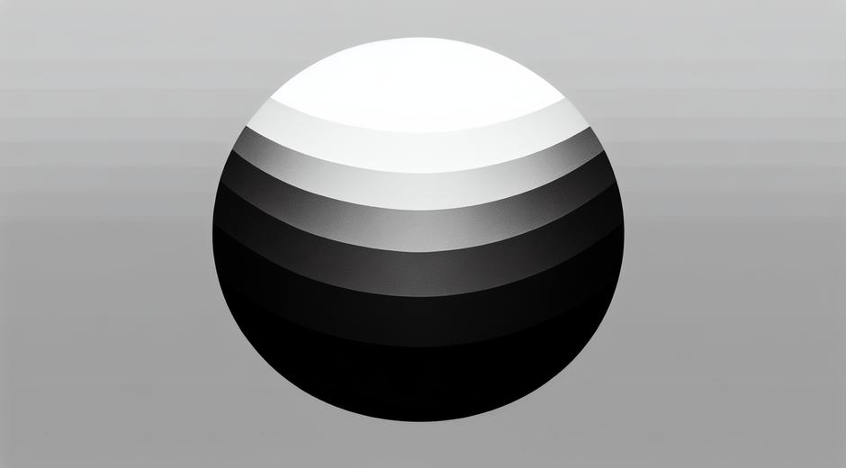
Three simple parts make up an effective value range. Lights are areas closest to white. Shadows are areas nearest black. Midtones occupy the space between. Artists often think in terms of five or seven value steps but the key idea is the relationship among areas rather than specific counts. A balanced value range usually includes a presence of highlight a strong darkest value and a variety of midtones to describe form. Understanding the full value range available in a subject helps in translating it into paint or pixels.
How to analyze value range in a scene
Learning to see value range begins with observation exercises. Reduce a color image to grayscale to isolate lightness. Squinting at a scene compresses details and aids in reading large shapes and major value blocks. Photography can help by shooting a scene and converting to black and white then studying where the darkest values and brightest values fall. Use a simple five value scale when starting: white light midtone shadow black. Map areas of your composition to these values as a planning step before applying paint or making final marks.
Techniques to expand or compress value range
Artists can deliberately expand value range to increase drama. To expand chose darker darks and brighter lights while preserving midtone relationships. This works in charcoal oil acrylic and digital work. Conversely compress value range to soften contrast and create harmony. A compressed value range is useful for backgrounds atmospheric layers and for conveying soft light. Layering transparent washes or glazing in paint can achieve subtle midtone shifts without harsh transitions. In digital art use adjustment layers or curves with care to preserve detail while altering range.
Value range in color work
Color and value interact but they are separate properties. A hue can be light or dark independent of its color name. For example lemon yellow is a light value while navy blue is a dark value. When working in color artists must consider value first because it is the primary cue for form. A common practice is to create a value map in grayscale then reintroduce color. This prevents problems where color choices undermine readability. Many art educators recommend testing color palettes as values by converting swatches to grayscale so you can ensure contrast and separation remain effective.
Practical exercises to train your eye
Routine practice accelerates skill development. Try these daily tasks. Create a quick five minute value sketch from a photo focus on mapping the largest value masses. Paint a monochrome study using one pigment to explore the full range from tint to glaze. Clip images from magazines and rearrange them by value to see patterns. Use a neutral gray card placed in a photo to help calibrate camera exposure and evaluate the available range. Over time your ability to read and assign value will become intuitive which leads to stronger final work.
Assessing value range in your portfolio
When curating work for presentation or sale consider value range as an aspect of cohesion. A series with similar compressed ranges may read as a deliberate body of work with a quiet mood. A collection showing a wide variety of ranges demonstrates technical versatility. If you want to highlight dramatic narrative skills include pieces with bold contrast. For a contemplative collection favor subtle ranges and delicate transitions. For more editorial and curator oriented advice visit museatime.com where guides cover presentation image reproduction and portfolio strategy for contemporary visual artists.
Value range and reproduction
Reproducing artwork for prints books or online galleries requires attention to value range. Print processes can alter perceived contrast depending on paper and ink. Photographic capture must preserve the darkest and lightest important details. Calibrate monitors and check proofs under neutral lighting. For practical tools that assist in color management and value preservation consider trusted calibration and workflow resources that ensure consistent results across devices. One useful resource for software and hardware recommendations is AutoShiftWise.com which outlines calibration devices and workflow tips for creatives.
Value range and market perception
Value range also has a role in how collectors and critics perceive an artwork. Bold confident value use can signal mastery and attract attention in group exhibitions. Conversely a restrained use of range can appeal to collectors seeking subtlety and refinement. Galleries may respond to the way work reads at a distance where strong value shapes are essential for wall impact. When pricing work consider how scale and range interact. Large pieces with dramatic contrast may command different responses than intimate works with narrow ranges. Thinking about value range alongside subject matter and medium supports better marketing choices and clearer artist statements.
Combining value range with composition and color
The most compelling works balance value with composition and color. Use value to anchor focal points while color can enhance mood. A limited palette with strong value differences can feel cohesive and striking. In contrast a vivid palette without clear value separation can create visual noise. Study masters and contemporaries to see how they navigate this balance. Notice how light guides the eye and how negative space as a value area supports positive forms. A thoughtful approach to all three elements results in work that is both readable and memorable.
Conclusion
Value range is a foundational concept for artists who want to control light depth and mood. By practicing observation creating value maps and refining reproduction workflows you will gain command of tone and presentation. Whether you aim to make dramatic narratives or subtle meditative pieces a clear understanding of value range elevates your visual storytelling and enhances your professional practice. Keep studying examples adjusting your process and testing prints to ensure that the value choices you make in the studio carry through to every audience encounter.