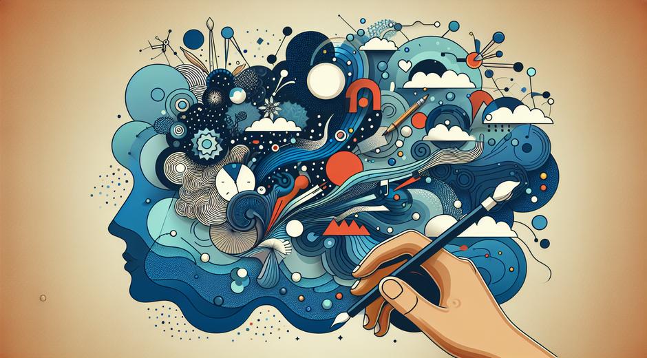


Visual Hierarchy A Practical Guide for Artists and Designers
Visual hierarchy is the invisible order that guides viewers through a work of art a poster or a web page. Mastering visual hierarchy helps artists and designers control focus create clarity and enhance communication. This article explains core principles and offers practical steps you can apply to paintings print layouts exhibition design and user interface work.
Why visual hierarchy matters
At its heart visual hierarchy is about prioritizing information. In a painting you may want the eye to land on a subject before noticing background elements. In a gallery layout you may want visitors to move from one piece to the next in a deliberate flow. On a web page clear visual hierarchy reduces confusion speeds comprehension and improves the overall experience. Strong hierarchy turns noise into meaningful order.
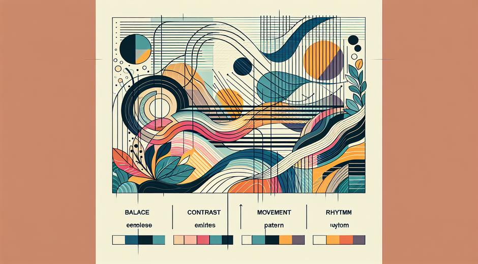
Core principles of visual hierarchy
Several basic tools shape visual hierarchy. Each one can shift attention subtly or strongly depending on how you use it.
Size Large elements attract attention first. Increasing scale is one of the fastest ways to create a focal point.
Contrast Contrast includes differences in color tone value and texture. A bright element on a dark background or a detailed area next to a simple field will stand out.
Color Color can direct attention through saturation warmth and value. Warm colors usually feel closer and more active. Cooler colors tend to recede.
Typography In textual work typography creates hierarchy with weight size and spacing. Choose a clear type scale and limit the number of distinct styles.
Whitespace The space around elements gives them room to breathe and makes important elements read as more significant. Effective use of space increases legibility and perceived value.
Alignment Consistent alignment builds order. Misaligned elements can create tension and draw the eye unintentionally.
Repetition Repeating colors shapes or motifs links parts of a composition and reinforces a flow. Repetition creates rhythm.
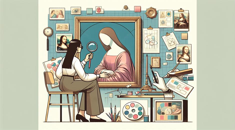
Applying visual hierarchy in fine art
Start with a single strong focal point. It can be a high contrast area a bright color or a detailed figure. Use leading elements like lines or light to guide the eye toward that focal point. Balance the composition by arranging supporting elements around the focal area so they reinforce rather than compete.
Consider value distribution. In many classic paintings a limited range of midtones surrounds a bright highlight and deep shadow. This contrast structure helps the main subject read instantly. You can also use color temperature to separate planes. Placing warmer hues in the foreground and cooler tones in the background creates depth and establishes a natural order of attention.
Using visual hierarchy in graphic design
Design for scanning. People rarely read every word on a page. Instead they scan for high value items. Use a clear typographic scale with distinct sizes for headings subheadings and body text. Place the most important message where the eye will land first and support it with contrast and spacing.
Limit the number of focal points. Too many competing elements reduce clarity. Aim for one principal focal point and one or two secondary points. Use color contrast subtle size shifts and directional cues to make the hierarchy obvious.
Visual hierarchy in web design and interfaces
On screens hierarchy influences clicks conversions and satisfaction. Start with a strong primary action or message. Make call to action buttons visually dominant through size and color while ensuring supporting options are visible but less prominent. Use clear headings concise micro copy and consistent spacing to guide users smoothly from the first glance to completion of a task.
Testing is essential. Run simple click tests or gaze tracking studies to confirm that the intended path matches actual user behavior. Small changes in spacing or color can produce large shifts in outcomes.
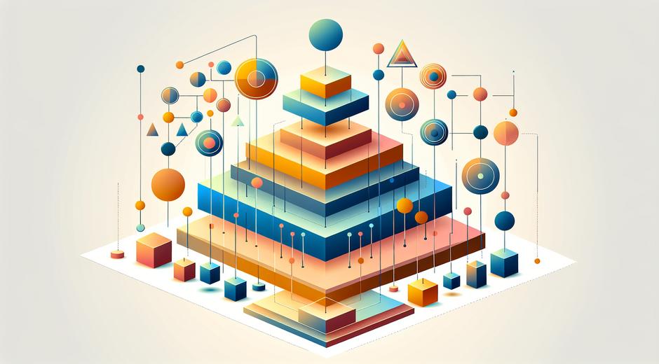
Practical steps to improve your visual hierarchy
Begin with a hierarchy map. Sketch a quick list of elements ranked by importance. Assign each element a visual weight based on size color contrast and position. Create multiple quick variations and compare them at a small scale. If the most important item is not immediately obvious make adjustments.
Use contrast intentionally. Increase difference between primary and secondary elements by adjusting color saturation value and edge clarity. For type increase weight or size for primary headlines and reduce decoration on supporting text.
Refine spacing. Increase space around important elements and tighten space where you want grouping. Consistent margins and gutters help maintain a stable rhythm that supports the hierarchy.
Harmonize color. Choose a limited palette that supports contrast without creating visual chaos. Use accent colors sparingly to highlight key elements.
Common mistakes to avoid
Overcrowding cramming too many focal points into one area makes it unclear where to look first. Excessive variety using many type styles colors or treatments reduces the power of hierarchy. Misplaced emphasis placing visual weight on secondary details confuses the narrative. Ignoring mobile and small screen constraints what looks clear on a large canvas may collapse on a phone screen so always check multiple sizes.
Tools and resources
There are many practical tools to help plan and test visual hierarchy. Simple wireframing and mockup apps help you experiment with size and spacing quickly. For deeper analysis eye tracking labs and usability studies can reveal unconscious patterns of attention. Designers can also study classic works and analyze how masters used light color and composition to direct attention.
For inspiration and case studies related to design and creativity visit resources such as Techtazz.com where you will find guides on design process tools and research that complement visual practice. For articles focused on art design and criticism explore content on museatime.com where ideas about composition and display are shared with artists and curators.
Checklist for strong visual hierarchy
Rank content by importance.
Make the top rank clearly dominant through size color or contrast.
Use whitespace to separate and emphasize groups.
Limit focal points to one primary and a small number of secondary ones.
Maintain consistent alignment and spacing rules.
Test on different sizes and gather feedback.
Conclusion
Visual hierarchy is a foundational skill that bridges fine art design and user experience. It is both an aesthetic decision and a communication strategy. By mastering scale contrast color and spacing and by testing your choices you can craft work that conveys meaning with clarity and grace. Whether you are hanging a painting arranging an exhibit or designing a site clear visual hierarchy makes the intended message obvious and memorable.