

Visual Mass in Art and Design: How to Create Weight and Presence in Your Work
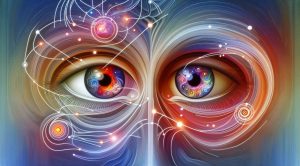
Visual Mass is a core concept for artists and designers who want to control how a viewer moves through an image and where the eye rests. At its essence Visual Mass refers to the perceived weight or presence of an element within a composition. It is not literal weight but a psychological measure of how strongly a shape color or texture attracts attention and feels heavy or light in relation to other elements. For readers who want more examples and curated essays visit museatime.com to explore related articles and visual studies.
What Visual Mass Means in Practice
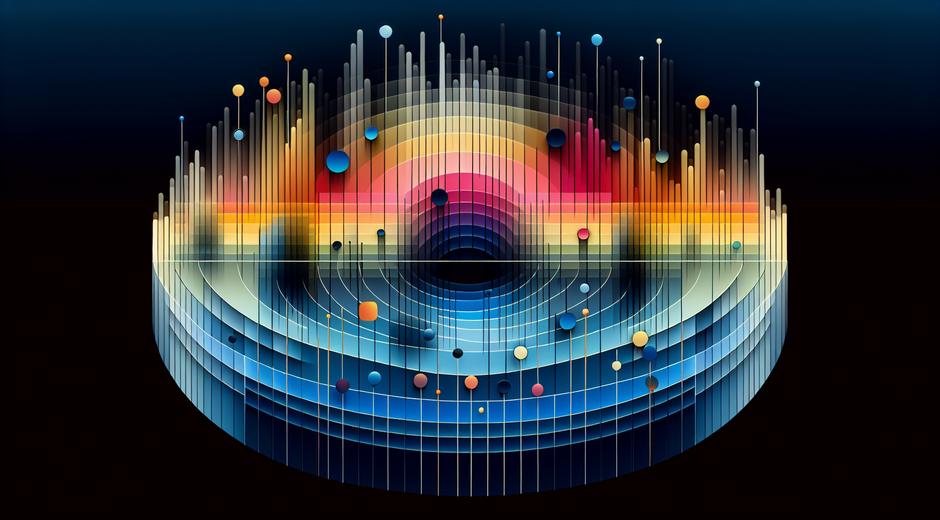
When you look at a painting a poster or a photograph certain parts of the image will arrest your attention first. Those parts carry high Visual Mass. Visual Mass emerges from several interacting factors. Size matters so do contrast and color saturation. A small intensely bright object can outweigh a large muted area. Texture and detail add mass because they give the eye more information to process. Position in the frame also shifts mass. An object placed away from the center can feel heavier because it pulls the eye across the composition. Understanding Visual Mass allows you to create clear focus and to balance or unbalance a composition on purpose.
Key Factors That Create Visual Mass
To build Visual Mass deliberately use these factors as tools
Color and saturation: Bright saturated colors tend to have more mass than desaturated ones. Warm colors often feel heavier than cool colors when other variables are equal.
Size and scale: Larger forms usually carry more mass but size interacts with other cues. A small object with high contrast may feel heavier than a large low contrast field.
Contrast and value: Strong light dark contrast draws the eye and increases perceived mass. Isolate contrast to emphasize a focal area.
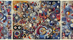
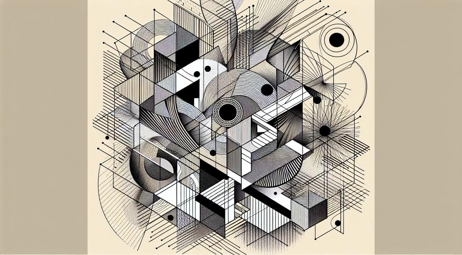
Texture and detail: Highly detailed or textured surfaces attract attention. Smooth empty areas feel lighter and can act as visual breathing space.
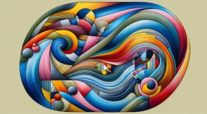
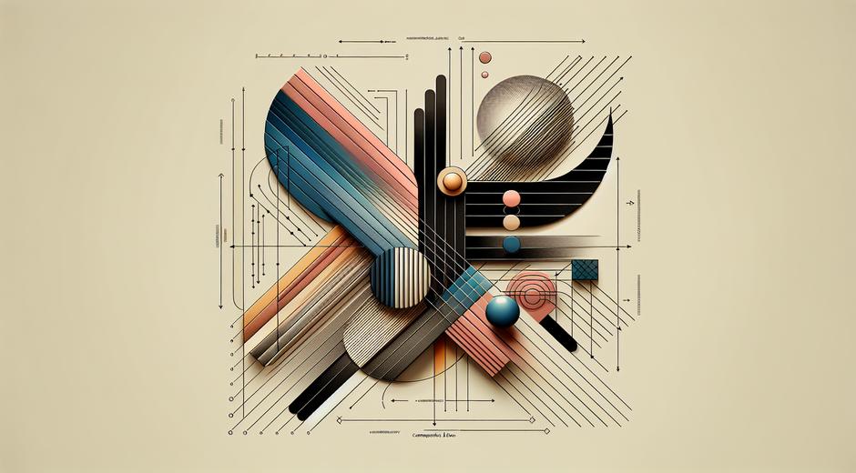
Shape and edge: Hard edged shapes with clear boundaries have more presence than soft fading shapes. Directional shapes that point into the composition can concentrate mass.
Placement and negative space: An object near the edge may feel heavier than one centered. Negative space gives context and can increase the relative mass of a solitary object.
Using Visual Mass to Build Strong Compositions
Balance is one of the most practical outcomes of manipulating Visual Mass. You can balance a heavy element with several lighter ones. For instance a small dark square on the left can be balanced by two lighter shapes on the right. This creates visual harmony or purposeful tension depending on your intent.
Hierarchy and order emerge from mass differences. The element with the most mass becomes the dominant focal point. Secondary elements with lower mass support the narrative. This hierarchy guides the viewer and improves readability of complex images.
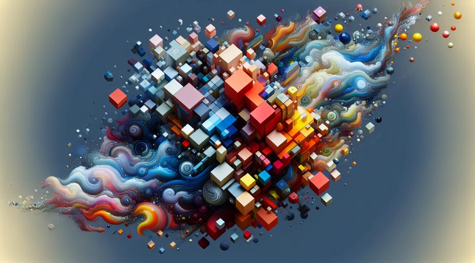
Rhythm and flow benefit from varied mass. Repeating elements with small variations in mass produces movement and interest. When mass is uniform the image can feel flat and monotonous.
Techniques for Painters Photographers and Designers
Painters: Use value contrast to create mass quickly. A dark form against a light field commands presence. Layer texture and impasto to increase tactile mass. Adjust brushwork to direct the eye along pathways that lead to your focal area.
Photographers: Control Visual Mass with exposure and depth of field. A sharply focused subject against a soft background will have more mass. Use framing and negative space to enhance the presence of a subject. Color grading can shift mass by changing relative saturation and contrast.
Graphic designers: Size typography and color to set mass hierarchy. Large bold type has high mass so use it sparingly for primary messages. White space reduces mass making nearby elements stand out more. Use grids to distribute mass evenly or intentionally break the grid for emphasis.
Sculptors and installation artists: Physical weight is not always the same as Visual Mass. Materials that reflect light or have complex surfaces attract more visual mass. Positioning and lighting alter perceived mass. A small shiny object under a spotlight may dominate a large matte installation.
Exercises to Train Your Eye
Practice these simple exercises to refine how you see and manage Visual Mass
One element balance: Place one object on a simple background. Move it to different positions and change its value or color. Note how placement and contrast change the way the object feels in the frame.
Multiple items shift: Use three shapes of different sizes. Try to balance perceived weight by changing their colors and values. This trains decision making about how several elements interact to produce equilibrium.
Negative space challenge: Create compositions where empty space is the main device. Observe how negative space increases the relative mass of small details. This builds restraint and subtlety in composition.
Comparative sketching: Draw the same scene in high contrast and low contrast versions. Compare how focal points shift and what needs to be adjusted to maintain the same visual narrative.
Common Mistakes and How to Fix Them
Ignoring contrast: Many images fail because contrast is too low so no element achieves sufficient mass. Increase contrast or introduce a color pop to create a focal point.
Over saturating: Too many saturated areas compete with each other. Reserve saturation for primary elements and reduce it elsewhere. This prevents visual confusion and sharpens hierarchy.
Cluttering without value: Adding detail does not always increase mass unless it is purposeful. Unfocused detail makes the image heavy in all the wrong ways. Remove or simplify to let true focal areas breathe.
Centering everything: Center placement reduces dynamic tension and can flatten Visual Mass. Use off center placement to create direction and interest unless your goal is formal symmetry.
Applying Visual Mass Across Disciplines
Visual Mass is a universal idea that applies to every visual discipline. In film storyboards mass helps establish where the viewer should look in a moving image. In web design mass guides clicks and reading order. In product design mass influences perceived value and stability. Thinking in terms of Visual Mass makes your work purpose driven. It connects formal decisions to the viewer experience directly.
For visual resources and media that help you explore mass in action consider curated collections and reference sites that present work across genres. One resource worth seeing for visual reference is Moviefil.com where imagery and frames offer strong examples of how mass functions in narrative imagery.
Conclusion
Visual Mass is not a single technique but a set of relationships that you can control. When you learn to balance size color contrast texture and placement you gain authorship of how viewers experience your work. Practice the exercises above analyze masterworks and document your decisions. Over time you will be able to design compositions that feel intentional confident and communicative. Use Visual Mass as a tool to create clarity mood and narrative in every project you undertake.