

Warm Cool Contrast in Art How to Master Color Temperature
Understanding warm cool contrast is one of the most powerful tools an artist can learn. Whether you work in painting drawing digital media or photography the way you place warm colors next to cool colors can control mood focus depth and visual harmony. This article explores the theory and practice of warm cool contrast and offers clear strategies you can apply to compositions across styles and media.
What Warm Cool Contrast Means
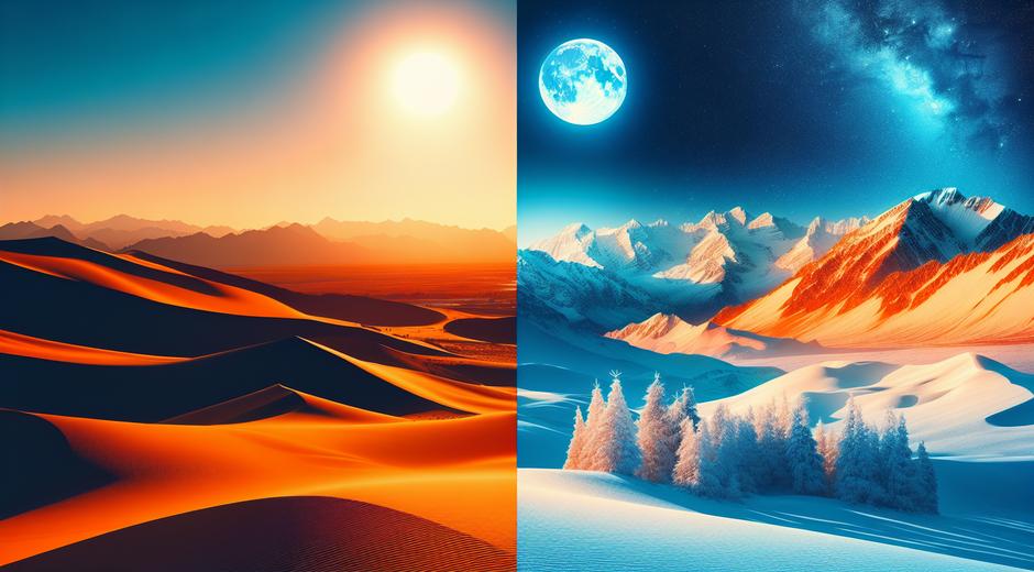
Warm cool contrast refers to the relationship between colors that are perceived as warm and those that are perceived as cool. Warm colors include reds oranges and yellows. Cool colors include blues greens and violets. When warm colors are set against cool colors the viewer senses a push and pull that creates emphasis and spatial separation. This contrast is not only a matter of hue. It also involves value intensity and saturation. When you combine these elements intentionally you can guide the eye and shape emotional tone.
Why Warm Cool Contrast Matters in Visual Art
Artists use warm cool contrast to direct attention to focal points to create depth and to influence emotional response. Warm hues tend to appear closer to the viewer while cool hues recede. This optical effect allows a flat canvas to feel layered. In figurative work a warm face set against a cool background reads as foreground. In landscapes warm highlights imply sunlight while blue shadows suggest distance. The contrast also enhances readability of shapes and patterns and makes color relationships feel more dynamic than if you relied on value or line alone.
Historical Uses of Warm Cool Contrast
Throughout history masters have exploited warm cool contrast. In classical painting warm highlights balanced cool shadow planes to model form. Impressionists pushed the idea further by placing complementary warm and cool strokes next to each other to produce shimmering effects. Modern artists still draw upon these traditions while experimenting with new palettes and light sources. Knowing this lineage helps contemporary creators adapt classic techniques for fresh visual statements.
How to Build Warm Cool Contrast in a Composition
Start by choosing your dominant temperature. Decide whether the composition will read as primarily warm or primarily cool. Next pick a contrasting temperature for accents or backgrounds. If the dominant area is warm use cool areas to frame or balance the piece. Pay attention to value and saturation. A muted warm area next to a saturated cool area may fail to register as contrast. Conversely saturated warm accents on a cool muted plane will read strongly and draw focus.
Practical steps include limiting the number of dominant hues and using temperature shifts to define planes. Paint the local color of an object while adjusting surrounding temperatures to emphasize form. For instance a white shirt can be warmed by reflected light or cooled by shade. Those small temperature choices convey material and light direction without added detail.
Warm Cool Contrast in Different Mediums
Oil and acrylic painters can blend temperature transitions smoothly or leave them abrupt for graphic effect. Watercolor artists often rely on the paper to create cool negative spaces while layering warm glazes to create focal points. Digital artists can use blending modes and color balance tools to refine temperature relationships without overmixing. Photographers control warm cool contrast by choosing time of day white balance and post processing shifts. In interiors warm cool contrast can change perceived size of a room and influence comfort. When teaching color to students it helps to provide comparative swatches so they can see the visual impact directly.
Using Warm Cool Contrast to Create Depth and Focus
One of the simplest uses of warm cool contrast is to establish depth. Use warm colors for foreground elements and cool colors for background areas. This creates a sense of atmospheric perspective that mimics natural light scattering. To direct focus combine warm local color with high saturation and place cooler less saturated tones around it. Fine tuning value contrast together with temperature contrast strengthens composition even further.
Another approach is to use warm cool contrast for storytelling. Warm tones suggest intimacy energy and closeness. Cool tones can feel distant calm or melancholic. By varying temperature across a narrative scene you can subtly guide the emotional reading of the image without altering subject matter.
Common Mistakes and How to Avoid Them
A common mistake is treating warm cool contrast as only a matter of hue. Ignoring value and saturation often yields weak relationships. Another error is using too many competing warm accents which can make the composition chaotic. Keep one strong temperature contrast and use smaller adjustments to support it. Also avoid relying on simple label rules. Context matters. A color that reads warm in one composition might read cool in another depending on adjacent colors and light source.
Exercises to Practice Warm Cool Contrast
Try a series of small studies focusing on a single color family. Paint the same scene twice once emphasizing warm shifts and once emphasizing cool shifts. Compare how mood depth and clarity change. Another useful exercise is to limit your palette to three colors one warm one cool and one neutral and experiment with mixing. For instructional resources and inspiration visit museatime.com where you will find galleries and tutorials that break down color strategies into step by step lessons.
Applications Outside Studio Practice
Warm cool contrast influences design fields beyond fine art. Brand identity product design and set design rely on temperature contrast to communicate tone and function. In family spaces color choices affect mood and behavior. For example choosing warm accent tones for play areas and cool tones for rest areas can help create balance. For broader lifestyle and parenting content that connects color choices with wellbeing see CoolParentingTips.com where experts discuss practical color led approaches for homes that support family routines.
Tips for Bringing Warm Cool Contrast Into Your Work
1 Observe real light in different conditions and note how temperature shifts across even neutral surfaces.
2 Make small tests before committing large areas to a single temperature. A thin glaze can change the feel of a whole painting.
3 Use chromatic grays and neutrals to bridge warm and cool areas when you need harmony without losing contrast.
4 Keep samples from each project so you build a personal sense of how specific pigments behave together across lighting conditions.
Conclusion
Warm cool contrast is a foundational concept that pays dividends across styles and disciplines. By mastering temperature relationships you can control emphasis depth and mood with a subtlety that lines and details alone cannot match. Practice with intention observe natural light and test combinations in small studies. Over time you will develop a reliable visual vocabulary that makes your work more expressive and effective. For ongoing ideas and project guides remember to check the curated resources at museatime.com and explore practical design tips for family spaces at CoolParentingTips.com.